20 Winter Wedding Color Schemes (2027)
By zainzari • Published October 22, 2026 • Updated October 22, 2026
 📌 Save
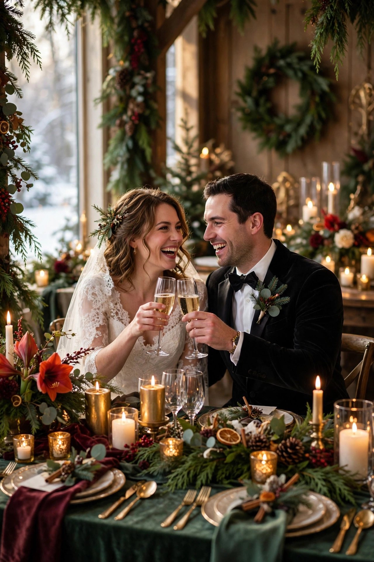
The best winter wedding color schemes for 2027 pair a deep, cozy base with one metallic or icy accent: emerald with gold, navy with silver, burgundy with blush, or all-white with crystal. Winter light is low and warm indoors, so rich saturation and texture — velvet, candlelight, and greenery — matter more than adding more colors.
Winter is the most forgiving season for color, because candlelight and low sun make almost every rich palette glow. The couples who get it right pick two main colors, one metallic, and then repeat them with discipline from invitations to napkins.
These twenty winter wedding color schemes range from icy and minimal to deep and dramatic, each with notes on where it shines. Use them as complete recipes: dresses, flowers, linens, and cake all pull from the same three or four swatches.
At a Glance: Winter Palettes Styles, Uses & Budgets
| # | Winter Palettes Idea | Mood | Best For | Budget |
|---|---|---|---|---|
| 1 | Emerald Green and Gold | Jewel rich | Ballrooms | $$$ |
| 2 | Icy Blue and Silver | Frosty elegant | Modern venues | $$ |
| 3 | Burgundy and Blush | Romantic deep | Historic houses | $$ |
| 4 | All White and Crystal | Snowy minimal | Luxury venues | $$$ |
| 5 | Navy and Champagne Gold | Classic formal | Evening weddings | $$ |
| 6 | Black and White with Gold | Bold monochrome | City venues | $$$ |
| 7 | Cranberry and Sage | Cozy harvest-winter | Barns and lodges | $$ |
| 8 | Plum and Lavender Frost | Moody pastel | Romantic venues | $$ |
| 9 | Charcoal and Dusty Blue | Muted modern | Industrial venues | $$ |
| 10 | Forest Green and Cream | Woodland calm | Lodges | $$ |
Budgets: $ = under $50, $$ = $50–$150, $$$ = $150+ for most decor and styling items; food and service costs vary by guest count and caterer. The full details for all 20 ideas are below.
Emerald Green and Gold
 📌 Save
Bring Emerald Green and Gold into the plan early and it instantly lifts the whole celebration. It photographs beautifully, feels personal, and gives guests a detail they will talk about long after the day ends.
Icy Blue and Silver
 📌 Save
Icy Blue and Silver is one of those choices that looks effortless but works hard behind the scenes. Styled with care, it ties the palette together and makes the setting feel intentional from the first photo to the last dance.
Burgundy and Blush
 📌 Save
For couples who want a memorable focal point, Burgundy and Blush delivers without overwhelming the rest of the design. It layers in texture, color, and a clear sense of season in a way guests instantly understand.
All White and Crystal
 📌 Save
Done well, All White and Crystal turns an ordinary moment into a signature scene. It is practical, pretty, and easy to adapt whether your venue is grand, rustic, or somewhere in between.
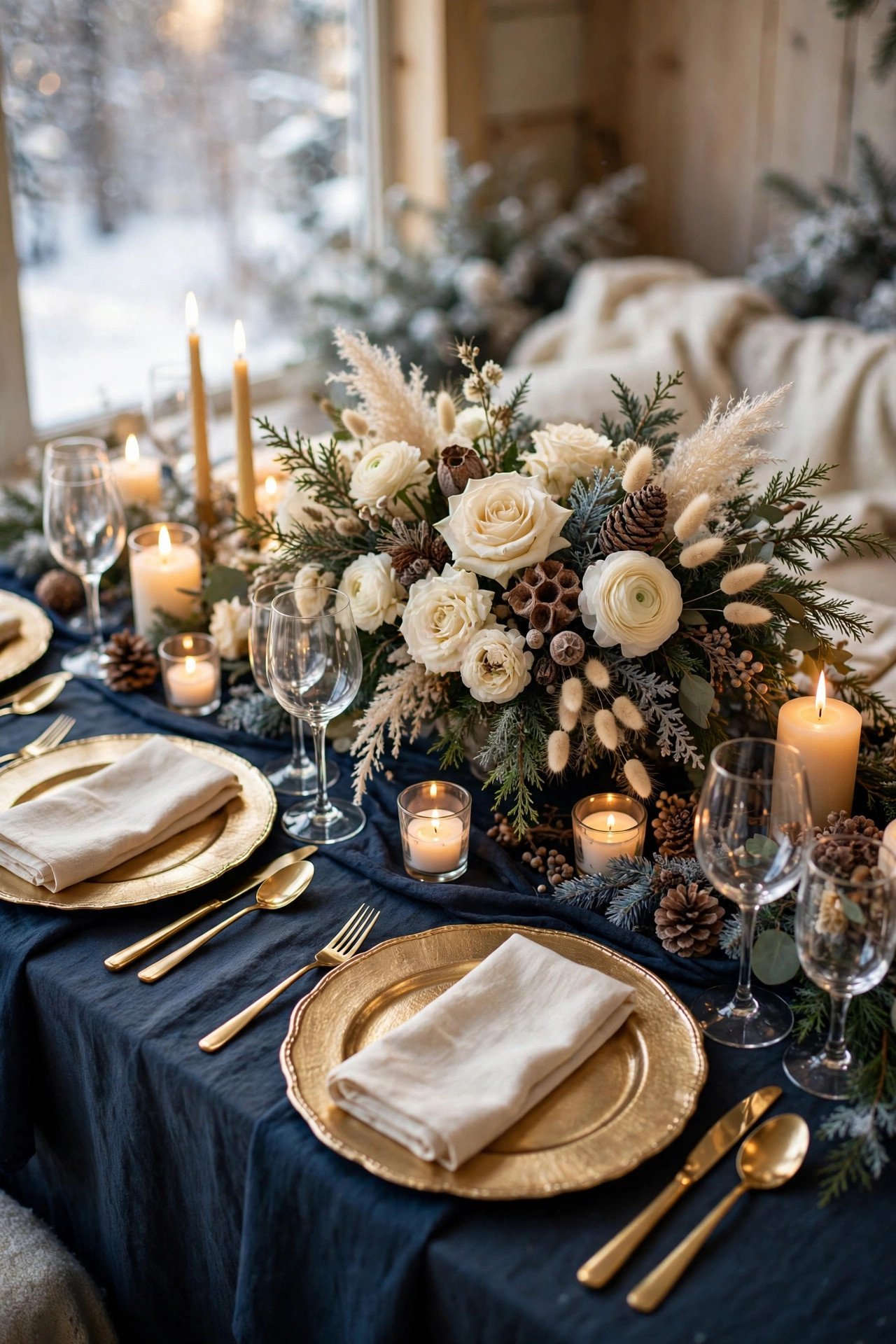
Navy and Champagne Gold
 📌 Save
Navy and Champagne Gold gives the day a polished, editorial finish while still feeling relaxed. It works across budgets because the impact comes from placement and styling, not from spending more.
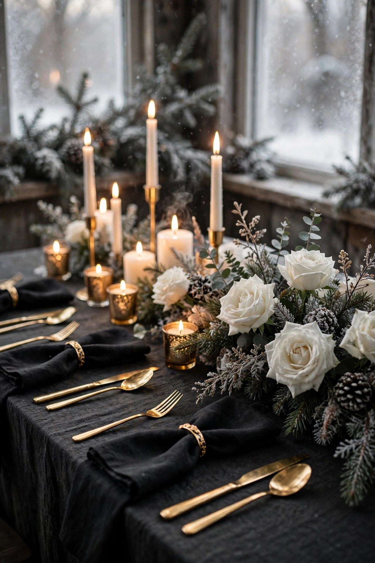
Black and White with Gold
 📌 Save
If you want one detail guests will photograph on their own phones, make it Black and White with Gold. It creates a natural gathering point and reads clearly in wide shots and close-ups alike.
Cranberry and Sage
 📌 Save
Cranberry and Sage adds warmth and personality without stealing focus from the couple. Pair it with simple surroundings and let this one idea do the talking.
Plum and Lavender Frost
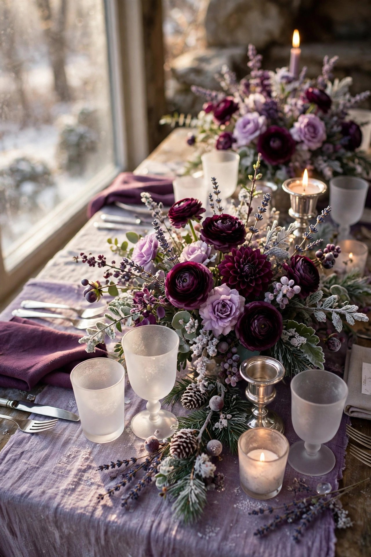 📌 Save
Seasonal, photogenic, and surprisingly simple to execute, Plum and Lavender Frost earns its place on the shortlist. It also gives your photographer a ready-made backdrop for portraits and detail shots.
Charcoal and Dusty Blue
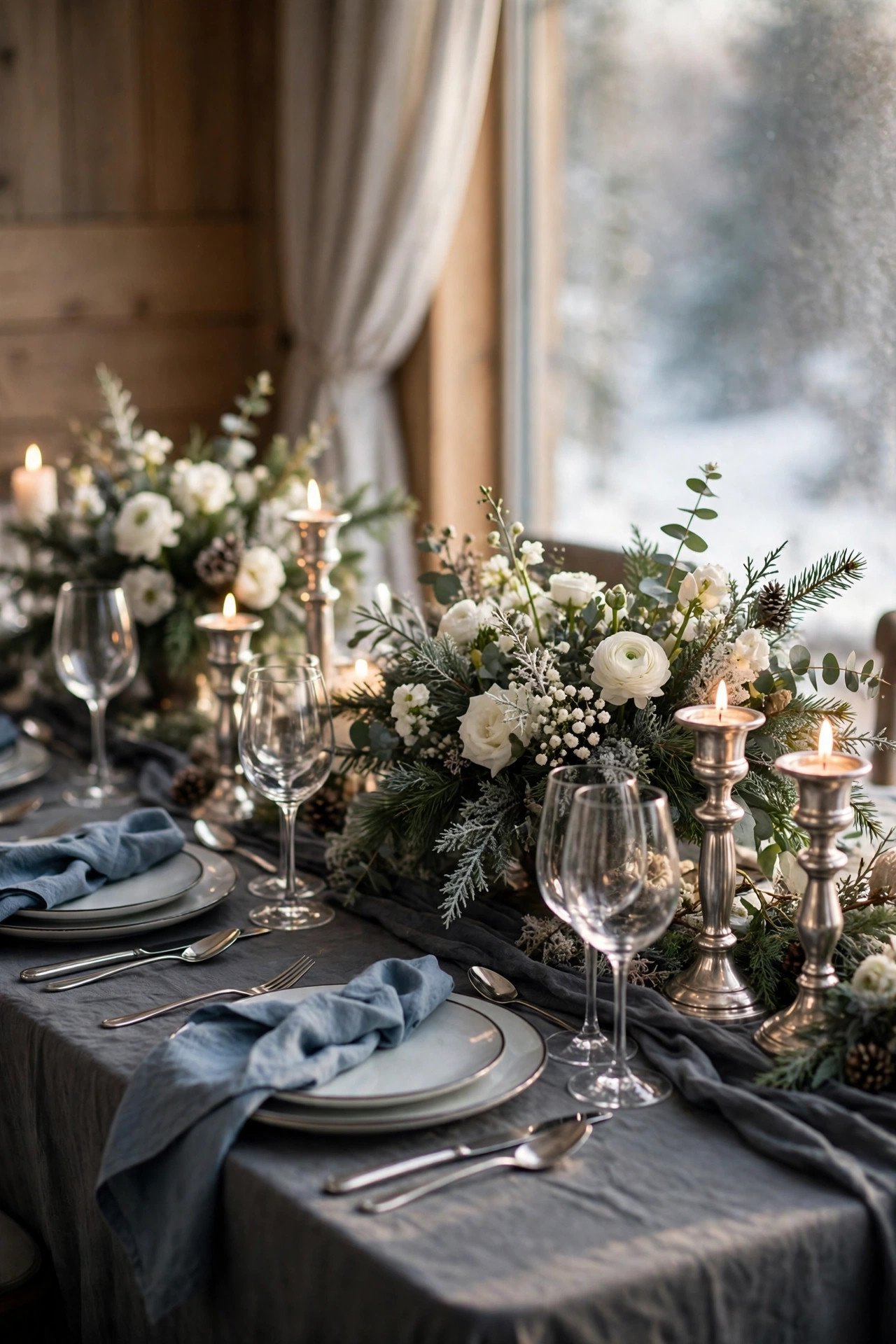 📌 Save
Couples love Charcoal and Dusty Blue because it feels fresh every time it is styled a little differently. Match it to your colors, keep the scale generous, and the result feels completely bespoke.
Forest Green and Cream
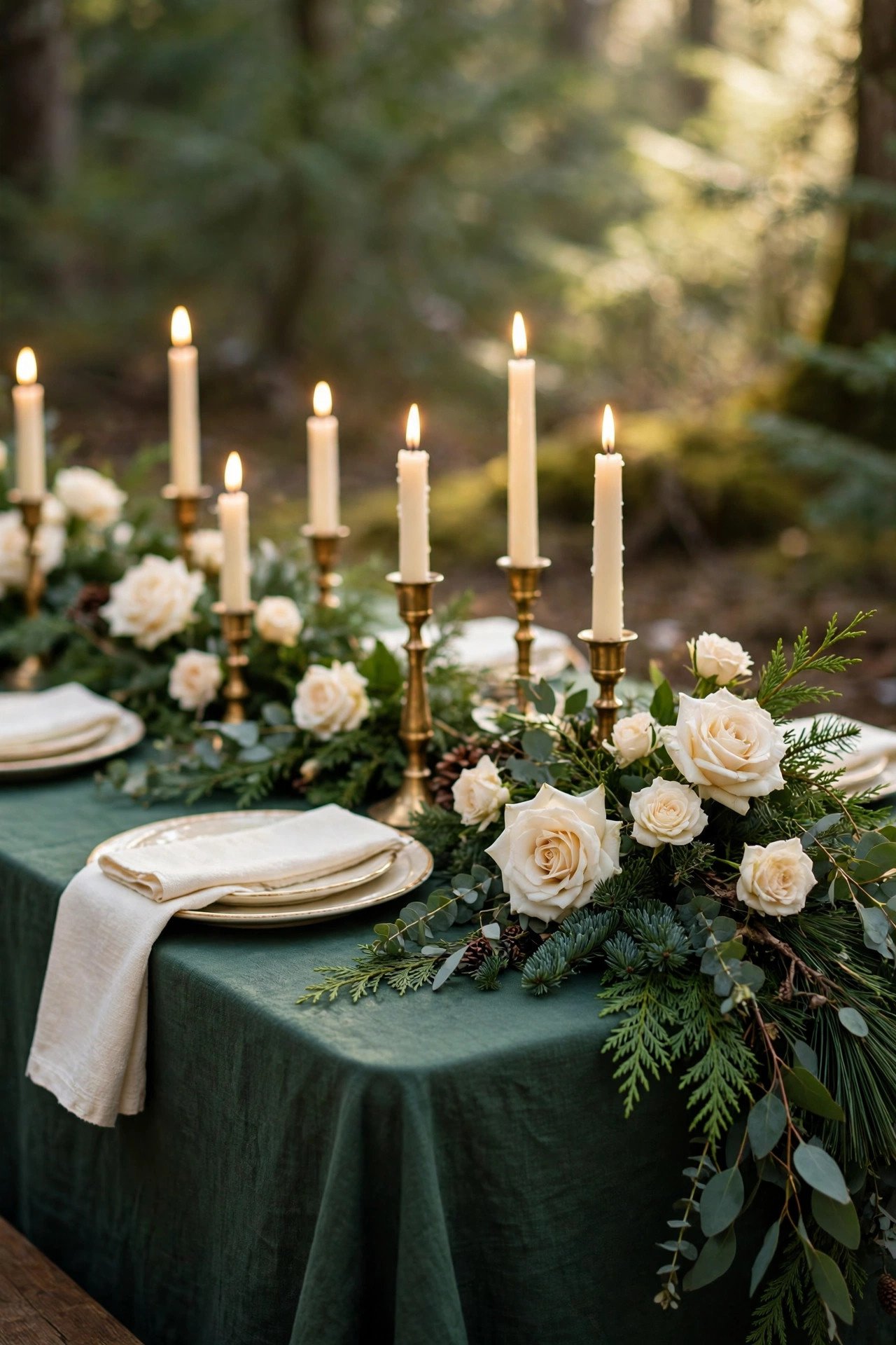 📌 Save
Forest Green and Cream is the kind of finishing touch that makes a venue feel like yours. It is easy to brief to a florist, planner, or caterer, and even easier for guests to enjoy.
Red and Gold Holiday Glam
 📌 Save
Bring Red and Gold Holiday Glam into the plan early and it instantly lifts the whole celebration. It photographs beautifully, feels personal, and gives guests a detail they will talk about long after the day ends.
Silver Grey and White Minimal
 📌 Save
Silver Grey and White Minimal is one of those choices that looks effortless but works hard behind the scenes. Styled with care, it ties the palette together and makes the setting feel intentional from the first photo to the last dance.
Teal and Copper Warmth
 📌 Save
For couples who want a memorable focal point, Teal and Copper Warmth delivers without overwhelming the rest of the design. It layers in texture, color, and a clear sense of season in a way guests instantly understand.
Midnight Blue and Starlight Silver
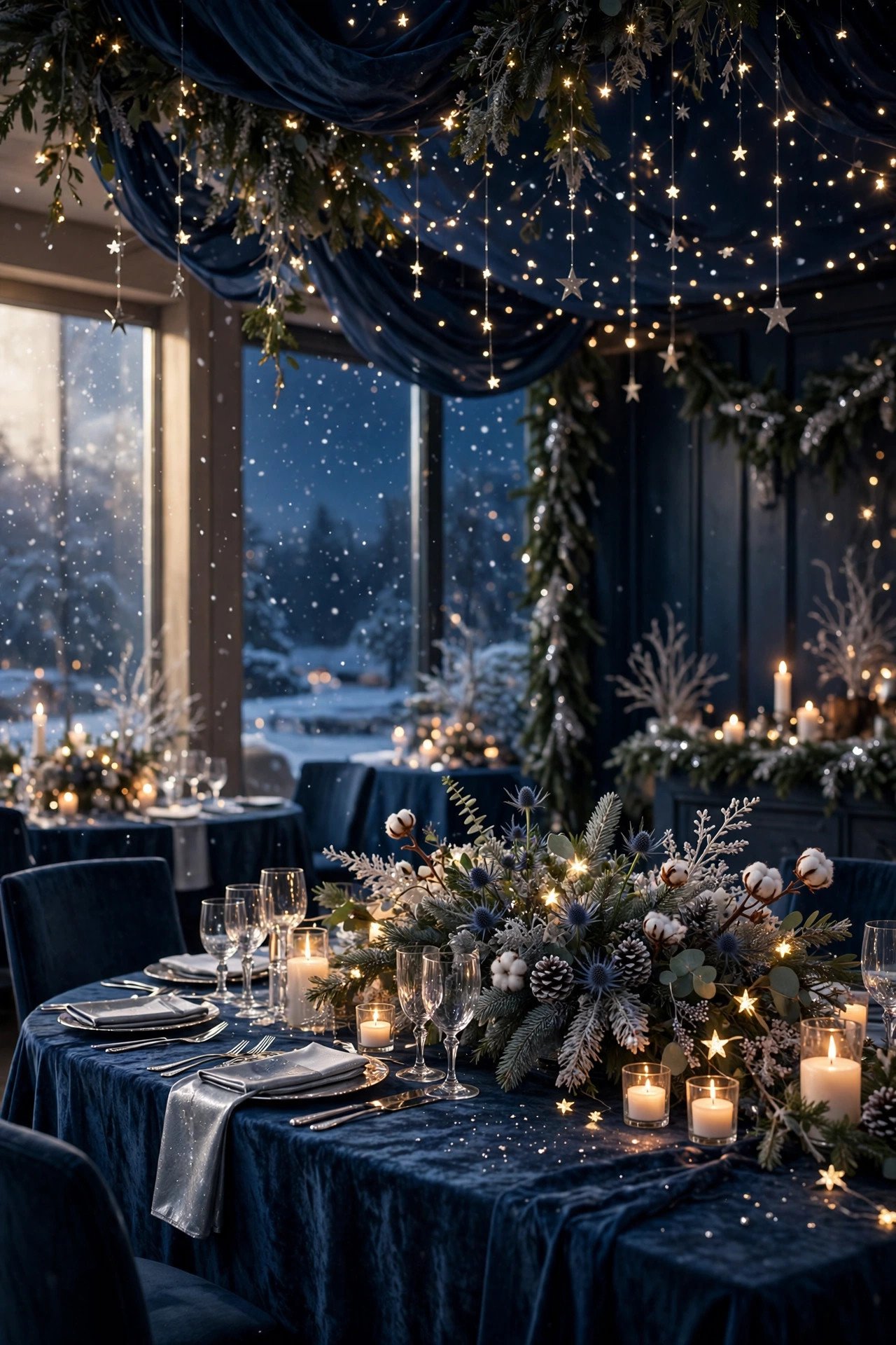 📌 Save
Done well, Midnight Blue and Starlight Silver turns an ordinary moment into a signature scene. It is practical, pretty, and easy to adapt whether your venue is grand, rustic, or somewhere in between.
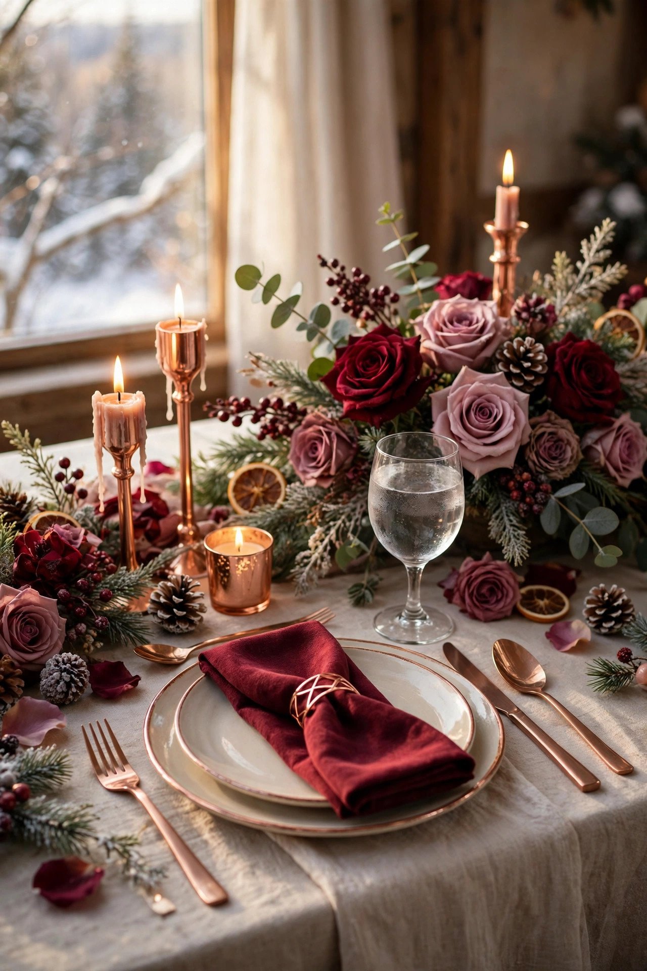
Burgundy, Mauve and Rose Gold
 📌 Save
Burgundy, Mauve and Rose Gold gives the day a polished, editorial finish while still feeling relaxed. It works across budgets because the impact comes from placement and styling, not from spending more.
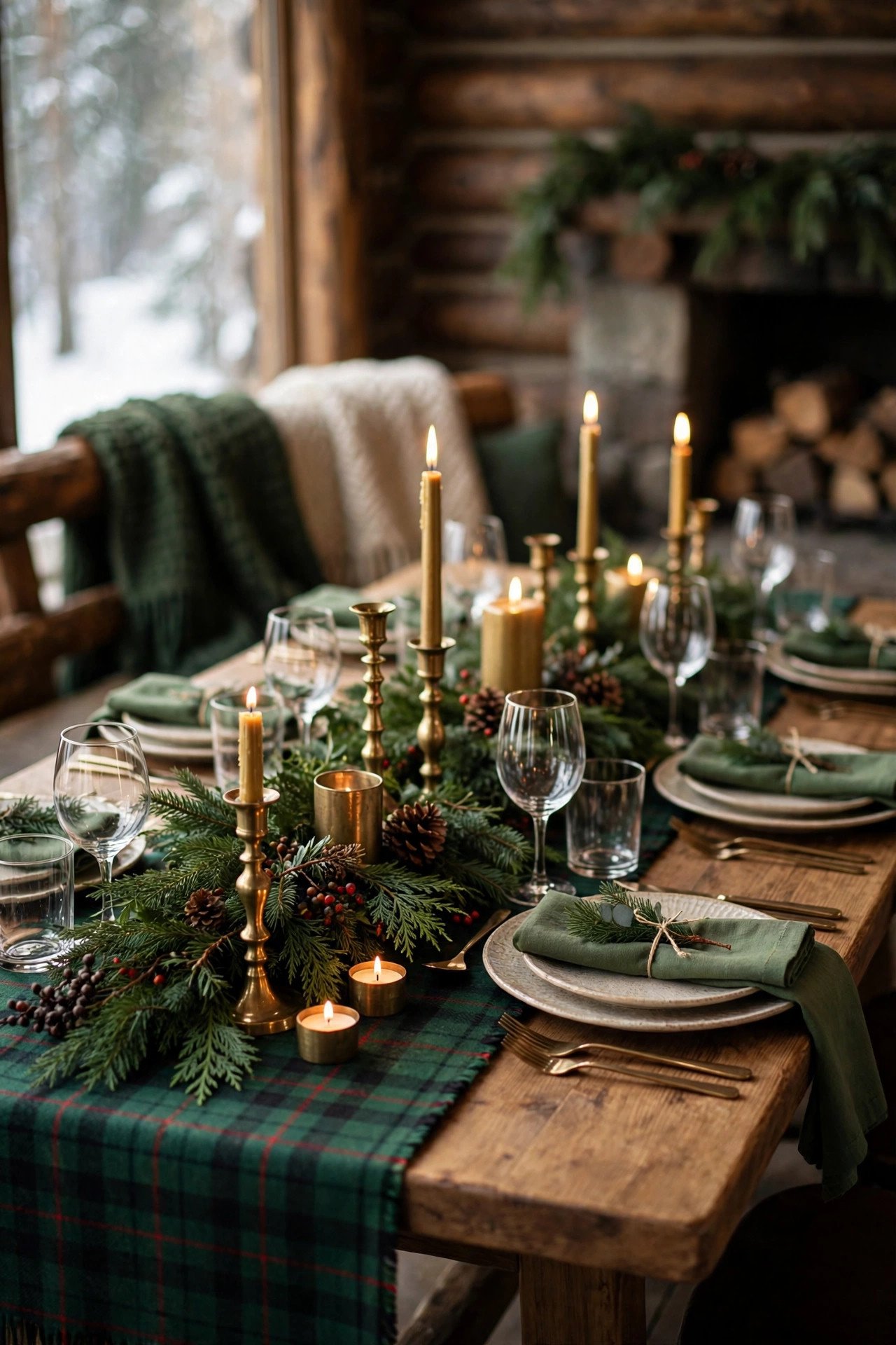
Hunter Green and Tartan Plaid
 📌 Save
If you want one detail guests will photograph on their own phones, make it Hunter Green and Tartan Plaid. It creates a natural gathering point and reads clearly in wide shots and close-ups alike.
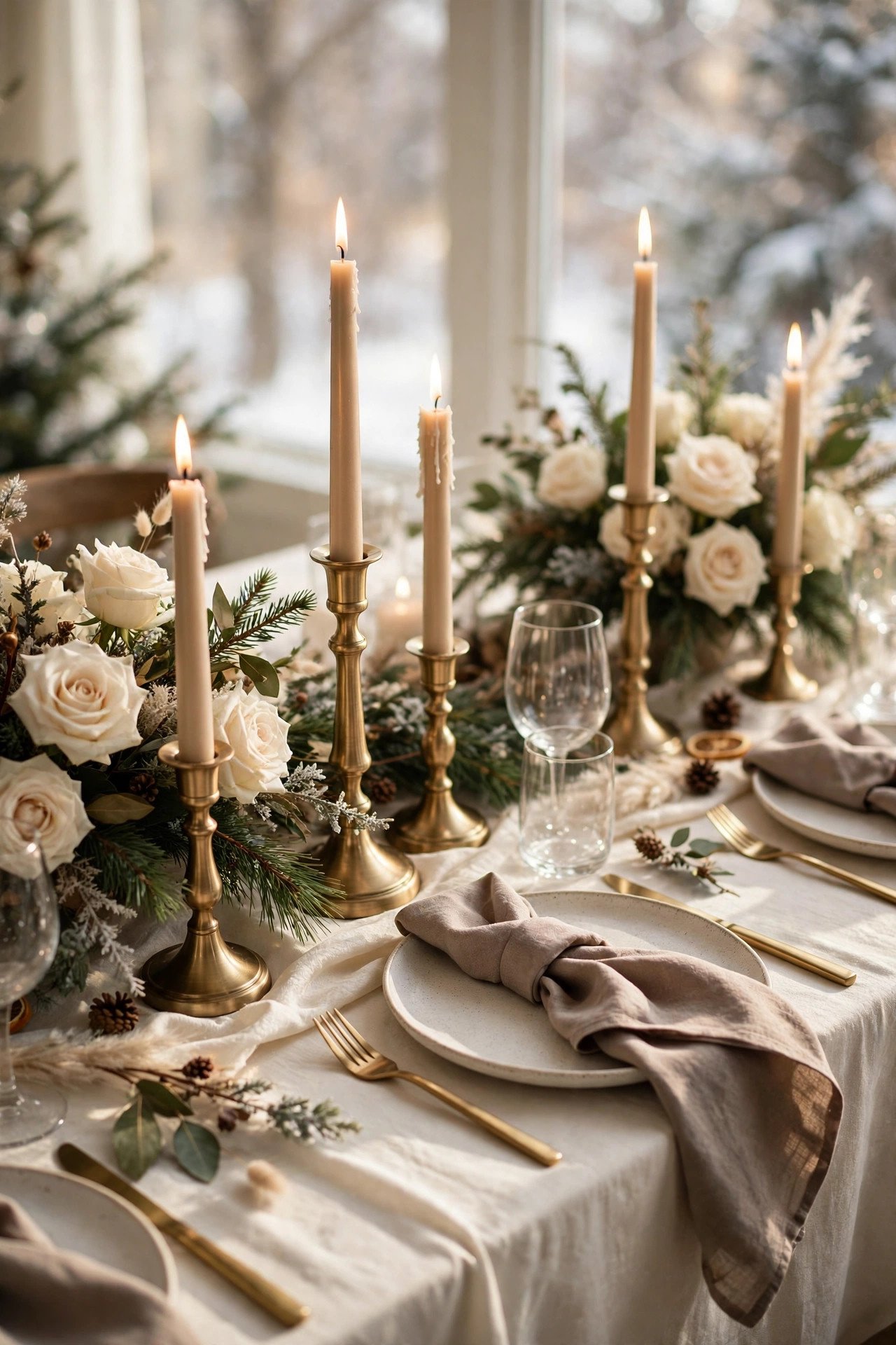
Ivory, Taupe and Brushed Brass
 📌 Save
Ivory, Taupe and Brushed Brass adds warmth and personality without stealing focus from the couple. Pair it with simple surroundings and let this one idea do the talking.
Frosted Pastels: Mint, Pink and Ice
 📌 Save
Seasonal, photogenic, and surprisingly simple to execute, Frosted Pastels: Mint, Pink and Ice earns its place on the shortlist. It also gives your photographer a ready-made backdrop for portraits and detail shots.
Chocolate Brown and Cream Velvet
 📌 Save
Couples love Chocolate Brown and Cream Velvet because it feels fresh every time it is styled a little differently. Match it to your colors, keep the scale generous, and the result feels completely bespoke.
Gold, Champagne and Candlelight Ivory
 📌 Save
Gold, Champagne and Candlelight Ivory is the kind of finishing touch that makes a venue feel like yours. It is easy to brief to a florist, planner, or caterer, and even easier for guests to enjoy.
20 Winter Wedding Color Schemes FAQs
What is the most popular winter wedding color scheme for 2027?+
Emerald green with gold and cream leads for 2027, followed by icy blue with silver and classic burgundy with blush for a romantic feel.
How many colors should a winter palette have?+
Two main colors plus one metallic and one neutral is the sweet spot. More than five shades starts to look undecided in photos.
Do winter palettes have to be dark?+
No. All-white with silver and crystal, or pale icy blue with white, feels like fresh snow and photographs beautifully in candlelight.
What fabrics suit winter color schemes?+
Velvet is the winter hero fabric for napkins, ribbons, and dresses. Satin, faux fur wraps, and brushed metallics add the texture winter palettes need.
How do you test a winter palette before booking?+
Gather real swatches — fabric, a flower, a candle, a plate — and photograph them together in warm indoor light, which is how guests will actually see them.
Key Takeaways
- Two main colors, one metallic, one neutral: that is the whole formula.
- Velvet and candlelight are winter texture; budget for both.
- Emerald and gold, icy blue and silver, and burgundy and blush lead 2027.
- Test swatches together in warm indoor light before committing.
- Repeat the palette in small touches everywhere rather than big statements in one place.
Final Thoughts
Winter color is less about the exact shades and more about commitment: pick your three or four swatches, then repeat them calmly everywhere. Add velvet, light the candles early, and even the simplest venue turns rich and cinematic. Trust the palette and resist adding one more color in the final week.