Wedding Invitation Calligraphy (2027)
By zainzari • Published October 23, 2026 • Updated October 23, 2026
 📌 Save
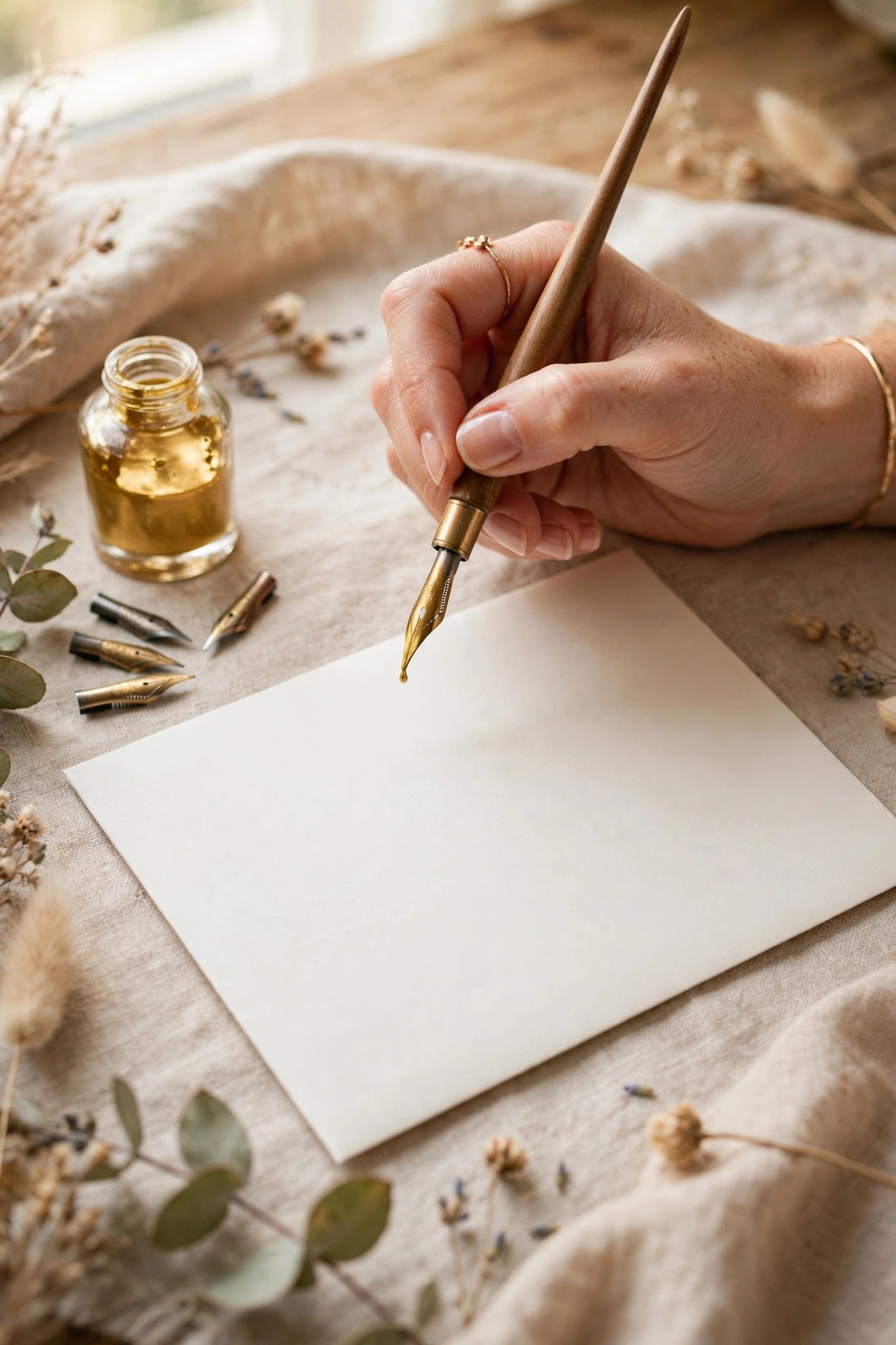
Wedding invitation calligraphy is hand-lettering — by a professional calligrapher or a skilled couple — used for the couple’s names on the invitation, guest names and addresses on envelopes, and day-of pieces like place cards and signage. In 2027, professional envelope addressing typically runs a few dollars per envelope for the outer envelope, with styles ranging from traditional copperplate to modern loose scripts and full custom lettering.
Of everything in the envelope, calligraphy is the part guests touch twice — once in the mailbox, once when they save it. A hand-lettered name carries a warmth no font has ever managed, because a person actually wrote it.
This guide covers the whole craft: the script styles, where calligraphy earns its place in a suite, what it costs, how to hire well, and how to learn enough of it yourself if your heart is set on DIY.
At a Glance: Each Topic, What It Covers & the Investment
| # | Topic | Covers | Investment |
|---|---|---|---|
| 1 | Why Calligraphy Still Matters in a Digital Age | Value & impact | All budgets |
| 2 | Copperplate: The Traditional Formal Script | Formal script | Professional |
| 3 | Modern Calligraphy: Loose, Bouncy & Personal | Relaxed script | Professional or DIY |
| 4 | Romantic Flourished Script for Names | Decorative names | Professional |
| 5 | Brush Calligraphy: Bold & Expressive | Bold strokes | DIY-friendly |
| 6 | Italic & Foundational Hands: The Quiet Classics | Broad-nib scripts | Professional |
| 7 | Custom Lettering: A Script Designed Only for You | Original artwork | Premium |
| 8 | Envelope Addressing: Where Calligraphy Works Hardest | Guest addressing | Per envelope |
| 9 | Invitation Names in Calligraphy, Body in Print | Names by hand | Premium |
| 10 | Place Cards & Escort Cards | Seating pieces | Per piece |
| 11 | Signage: Welcome Signs, Seating Charts & Menus | Large pieces | Per project |
| 12 | Ink Colors & Metallics: Gold, White & Beyond | Ink palette | Varies |
| 13 | Paper & Envelope Surfaces That Love a Nib | Surface matching | Planning |
| 14 | What Professional Calligraphy Costs | Pricing ranges | Budget planners |
| 15 | Hiring a Calligrapher: Portfolio, Samples & Contracts | Hiring process | Professional route |
| 16 | DIY Calligraphy: The Honest Beginner Path | Learning path | DIY couples |
| 17 | Faux Calligraphy: The Clever Shortcut | Any-pen technique | DIY & budget |
| 18 | Calligraphy Fonts & Printing That Imitate the Hand | Font alternatives | Budget allocation |
| 19 | Addressing Etiquette in Calligraphy | Name forms | Formal suites |
| 20 | Timeline: When the List Must Be Final | Scheduling | Planning stage |
| 21 | Calligraphy for Day-Of Details: Menus, Programs & Vows | Keepsake pieces | Per project |
| 22 | Preserving Calligraphy: Keepsakes & Framing | Preservation | After the wedding |
| 23 | Left-Handed, Accessibility & Reading the Script | Readability | All-ages lists |
| 24 | Common Calligraphy Mistakes (and Easy Saves) | Pitfalls | Every couple |
| 25 | Putting It Together: Your Calligraphy Plan | Full plan | Before booking |
Calligraphy is priced per piece and booked by the week, not the hour — popular calligraphers reserve wedding dates months ahead, especially for spring and autumn.
Why Calligraphy Still Matters in a Digital Age
 📌 Save
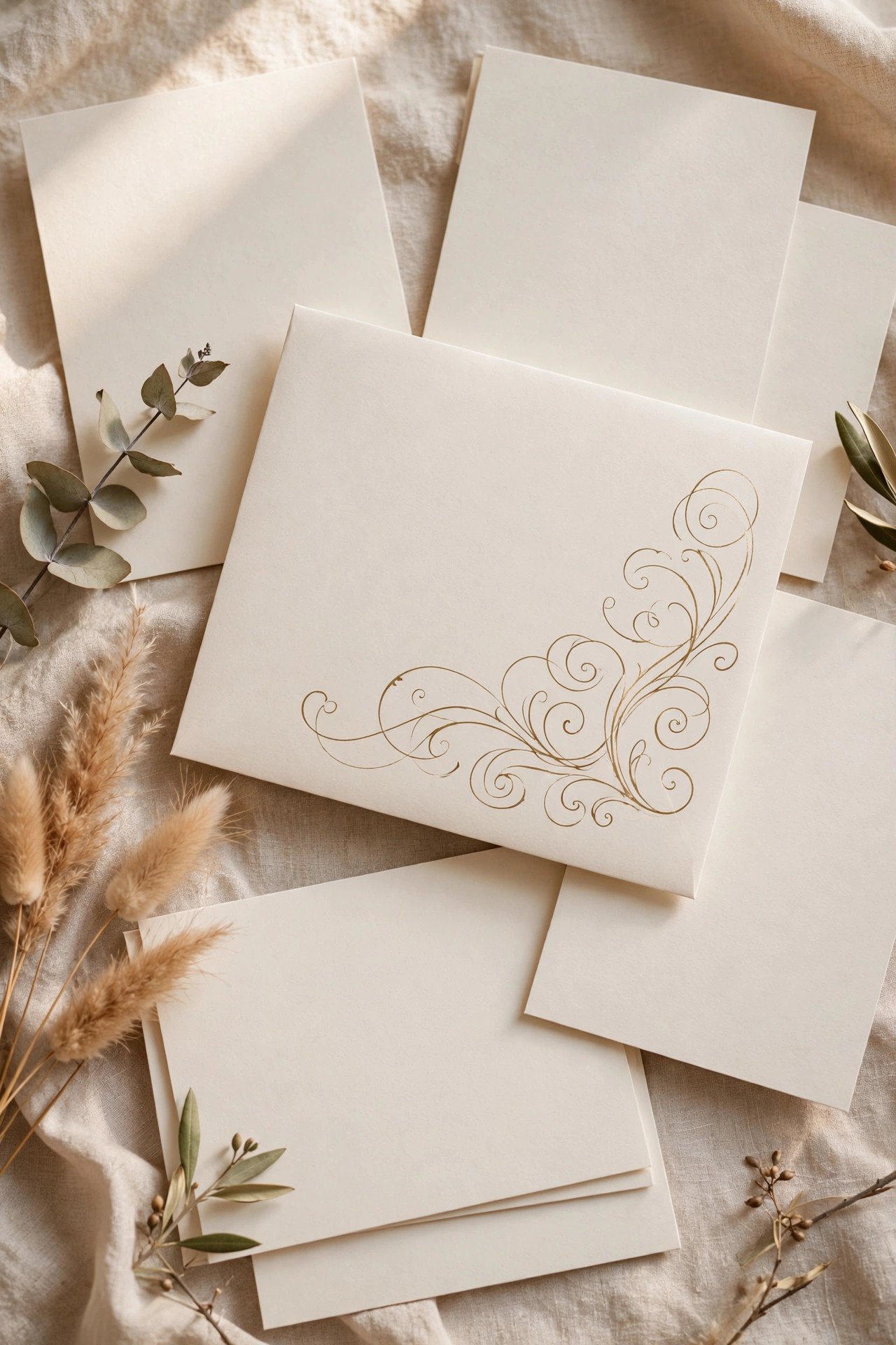
Printed perfection is everywhere; a human hand is not. Calligraphy tells a guest, before the envelope is even open, that this wedding was made slowly and personally. It also photographs like nothing else — your calligraphed suite will anchor your wedding album’s opening spread and your stationer’s portfolio for years.
Copperplate: The Traditional Formal Script
 📌 Save
Copperplate (and its cousin Spencerian) is the classic formal script: dramatic contrasts between whisper-thin upstrokes and rich shaded downstrokes, written with a flexible pointed pen at a slant. It is the script of state dinners and traditional weddings, and it pairs with engraved and letterpress invitations like it was born for them — it was.
Modern Calligraphy: Loose, Bouncy & Personal
 📌 Save
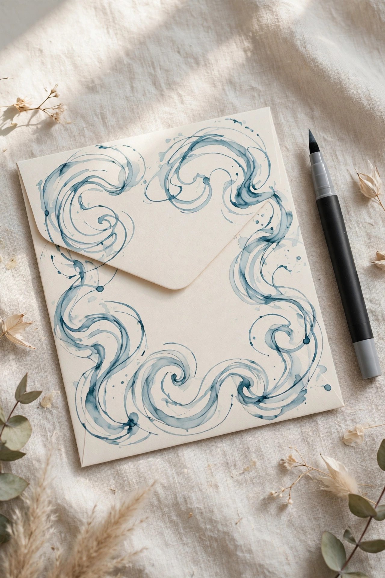
Modern calligraphy keeps the pointed pen but loosens the rules: letters bounce on the baseline, strokes vary playfully, and the writing has the energy of beautiful handwriting rather than ceremony. It suits garden, boho, and contemporary weddings, mixes happily with sans-serif print, and is the most-requested style of the last decade by a wide margin.
Romantic Flourished Script for Names
 📌 Save
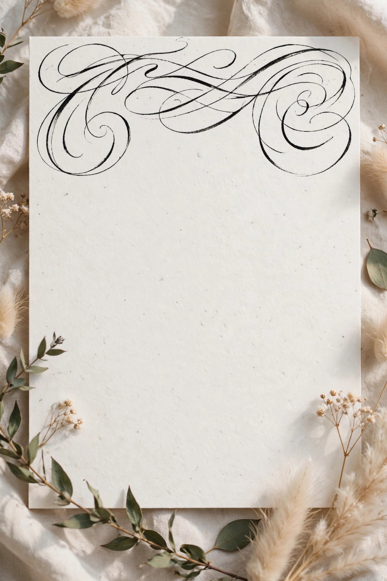
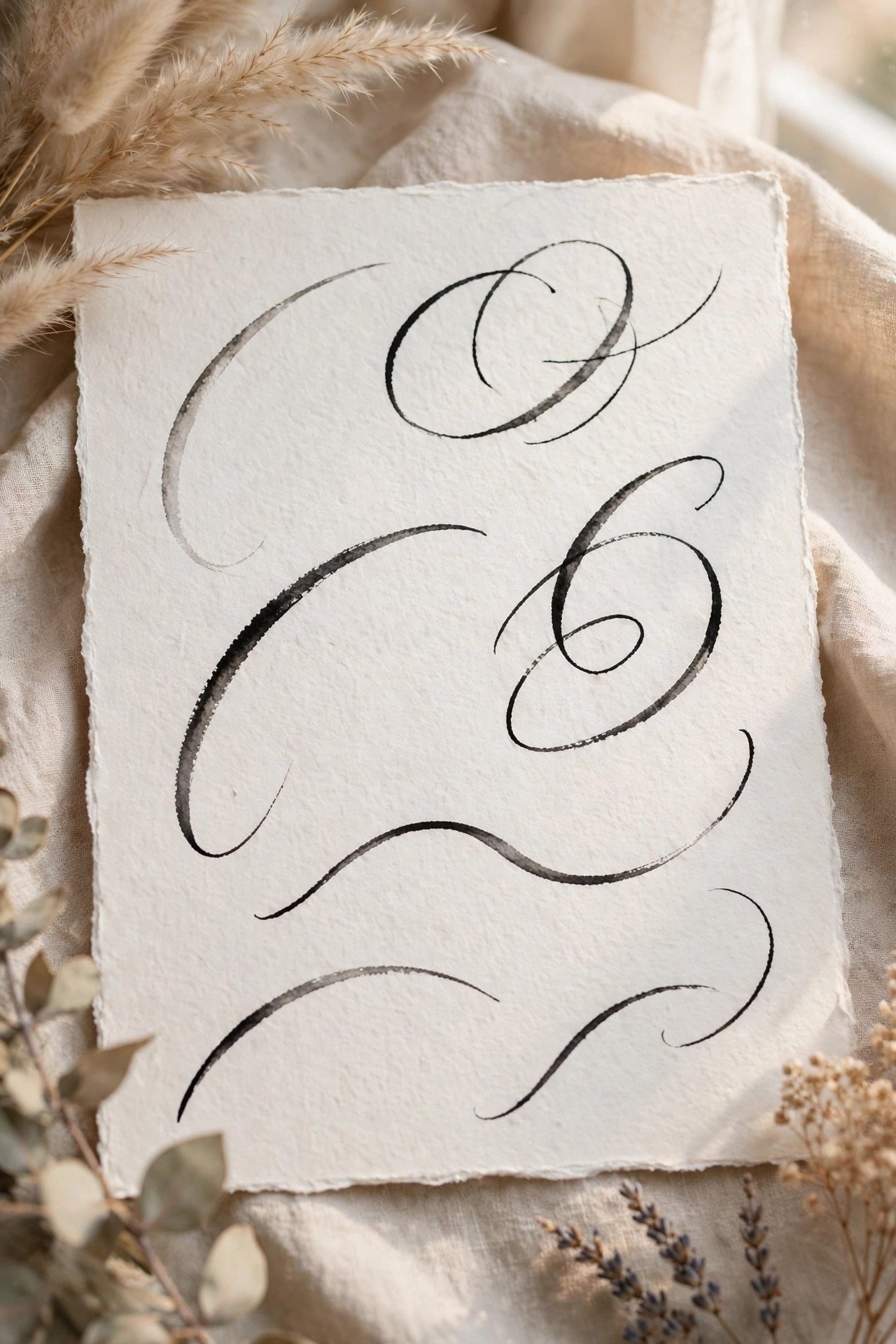
Flourished script adds sweeping loops, entry swirls, and extended cross-strokes to names — usually the couple’s names on the invitation itself and each guest’s name on their envelope. It is calligraphy as ornament: legibility stays high for names (context helps), and the flourishes become the suite’s signature artwork, often repeated on the menu and signage.
Brush Calligraphy: Bold & Expressive
 📌 Save
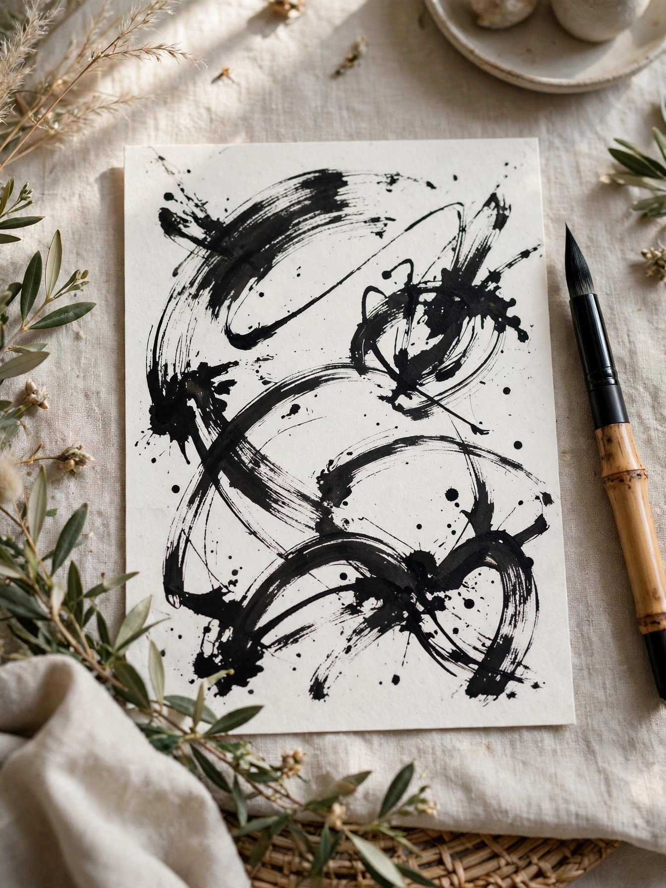
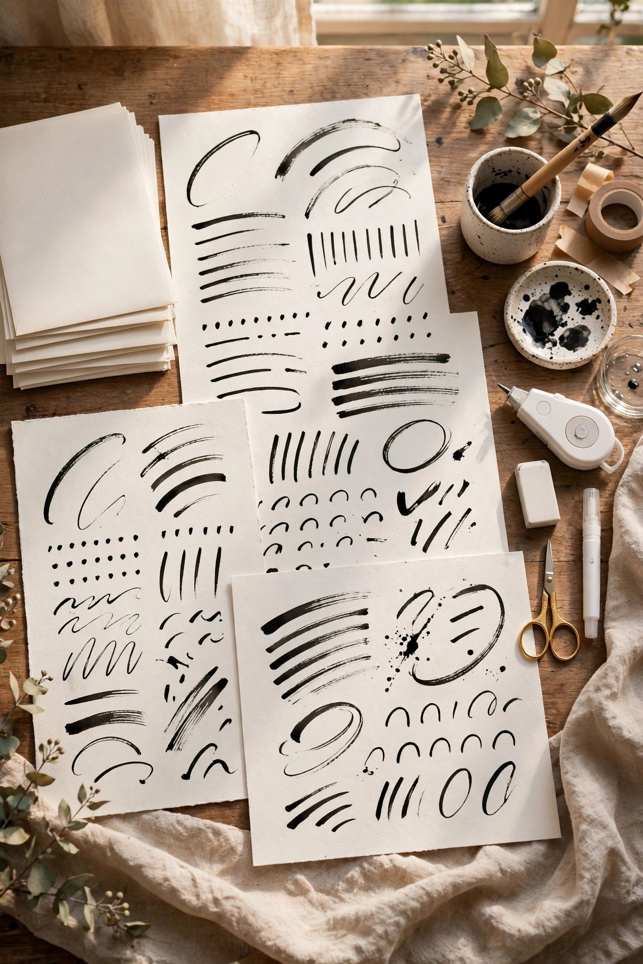
Brush calligraphy uses a brush or brush pen, producing bold, expressive strokes with a casual energy pointed pens can’t match. It shines at larger scales — welcome signs, seating charts, table numbers — and on materials nibs struggle with. On envelopes it reads modern and confident, best for relaxed weddings and couples whose style runs artistic rather than traditional.
Italic & Foundational Hands: The Quiet Classics
 📌 Save
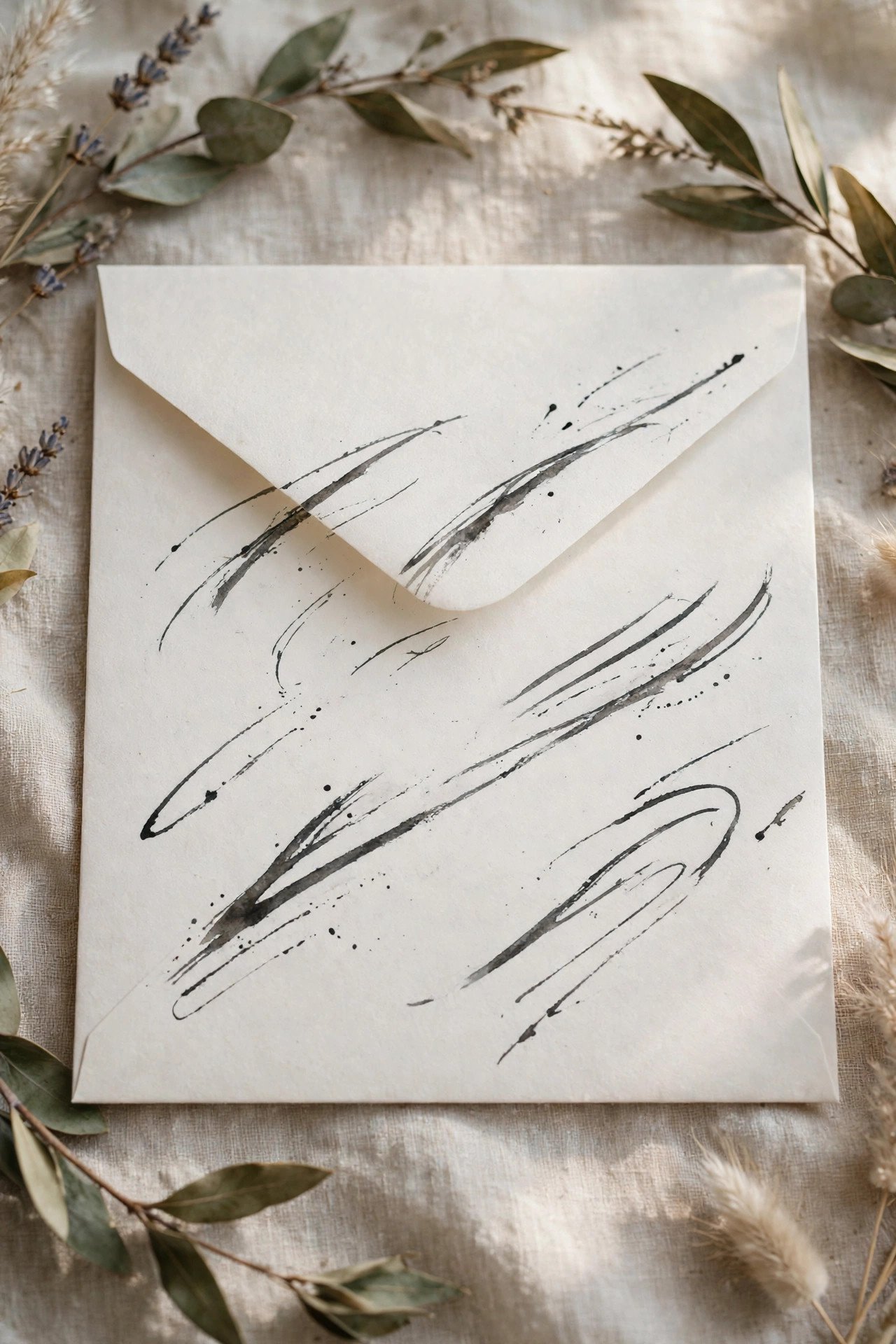
Italic and foundational hands are written with a broad-edged nib, giving letterforms their elegance from the pen’s angle rather than pressure. They read literary and calm — the choice for bookish couples, historic venues, and anyone who finds pointed-pen scripts too swirly. Italic envelopes look especially fine with traditional printed suites and wax seals.
Custom Lettering: A Script Designed Only for You
 📌 Save
Custom lettering goes beyond choosing a style: an artist designs your names, monogram, and key words as original artwork, delivered as files for printing and as hand work for envelopes. The lettering becomes a wedding identity — repeated on signage, menus, favors, and later on family stationery for years. It is the premium tier of calligraphy, and for design-led couples, the anchor of the whole aesthetic.
Envelope Addressing: Where Calligraphy Works Hardest
 📌 Save
Guest addressing is where calligraphy investment shows: a hand-lettered outer envelope (and inner envelope with names) transforms the mailbox moment for every guest. Pricing typically runs per envelope — a few dollars each for the outer in a standard style, more for flourished scripts, colored inks, and inner envelopes — and calligraphers need your final guest list, spelled exactly, weeks ahead.
Invitation Names in Calligraphy, Body in Print
 📌 Save
A beloved suite design: the stationer leaves the couple’s names (and sometimes the venue or date line) blank in the printed design, and a calligrapher hand-letters them on every invitation. The contrast between printed order and human script is luxurious, and the names become the artwork. It requires coordination — the printer leaves the right space, the calligrapher uses suite-matching ink — planned as one production.
Place Cards & Escort Cards
 📌 Save
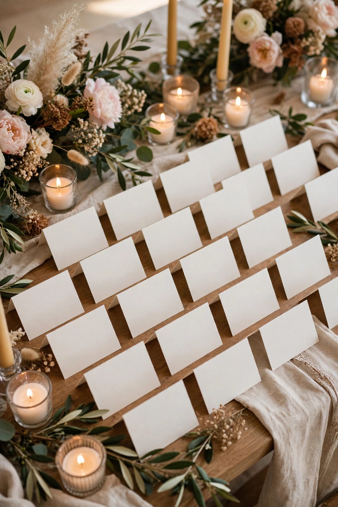
Place cards are calligraphy’s most-kept souvenir: guests pocket them. Hand-lettered tent cards, tiles, leaves, shells, or agate slices (venue permitting) carry the script from the envelope to the table, closing the loop beautifully. Escort cards with envelope-and-card formats give calligraphers more room and guests a keepsake with the table assignment inside.
Signage: Welcome Signs, Seating Charts & Menus
 📌 Save
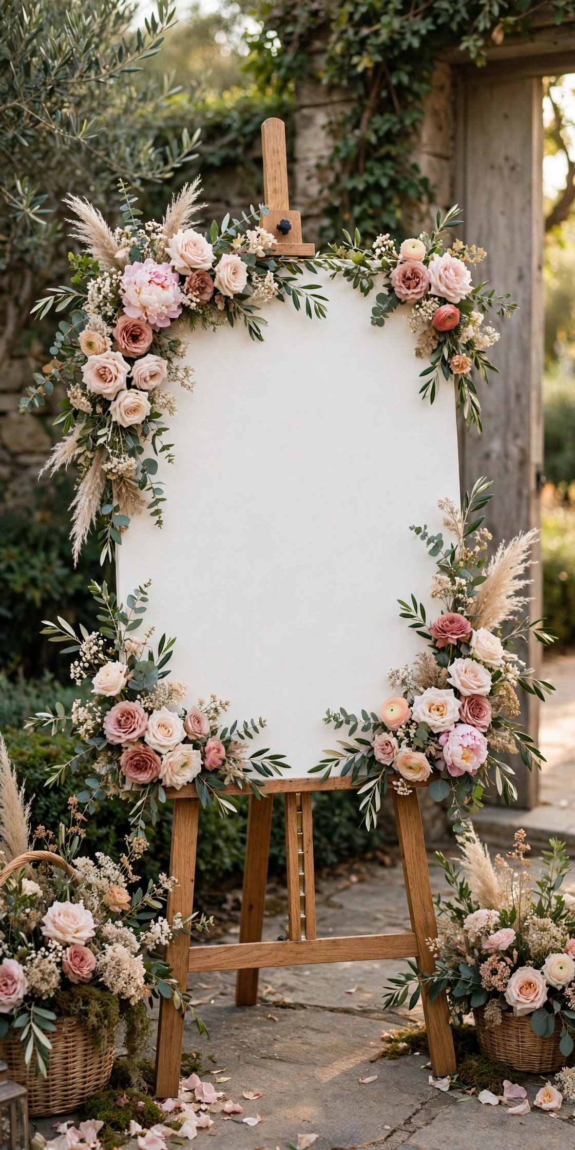
Calligraphers letter directly onto mirrors, acrylic, wood, chalkboards, and linen for welcome signs, seating charts, bar menus (sparkling cider and signature sodas letter beautifully), and unplugged-ceremony signs. Large-format work is priced per piece or per project, and materials logistics — delivering a six-foot mirror to a studio — become part of the plan. The payoff is a reception that speaks in one hand from door to dessert.
Ink Colors & Metallics: Gold, White & Beyond
 📌 Save
Ink is calligraphy’s palette: iron-gall and walnut inks give antique warmth; sumi black is the crisp classic; metallic gold, copper, and pearl inks (usually gouache-based) glow on dark envelopes; white ink on navy, black, or kraft is the modern showstopper. Metallics need wider nibs, frequent stirring, and slower writing — all priced into professional quotes, and all worth seeing in a sample before committing.
Paper & Envelope Surfaces That Love a Nib
 📌 Save
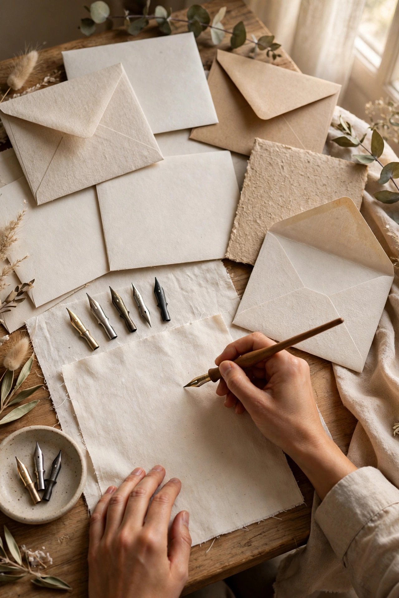
Pointed pens want smooth, bleed-proof surfaces: cotton papers, quality matte envelopes, and lightly sized stocks let ink sit in a crisp line. Rough handmade textures, glossy coatings, and fibrous recycled stocks cause catching, feathering, or bleeding — sometimes charmingly (a skilled hand can work deckled cotton), always worth a test. Give your calligrapher sample envelopes early; they will tell you in one stroke whether the surface sings or fights.
What Professional Calligraphy Costs
 📌 Save
As a general 2027 frame across the US, UK, and Canada: outer-envelope addressing commonly runs a few dollars per envelope (more for flourished scripts, dark envelopes, and metallic inks), inner envelopes and place cards add a smaller per-piece fee, invitation name-lettering is priced per suite, and signage is quoted per piece by size and material. Rush timelines add premiums everywhere. The universal rule: you are buying a skilled hand by the week, and masters book out — reserve early, budget honestly.
Hiring a Calligrapher: Portfolio, Samples & Contracts
 📌 Save
Hire from full-piece samples, not single names: consistency of slant, spacing, and letterforms across a complete envelope is the professional signature. Then confirm the working details in a simple contract — pieces and counts, ink and style, list deadline, delivery date, spare-piece policy, and deposit. Order a finished sample on your actual envelopes before the run; screens lie about ink behavior, paper never does.
DIY Calligraphy: The Honest Beginner Path
 📌 Save
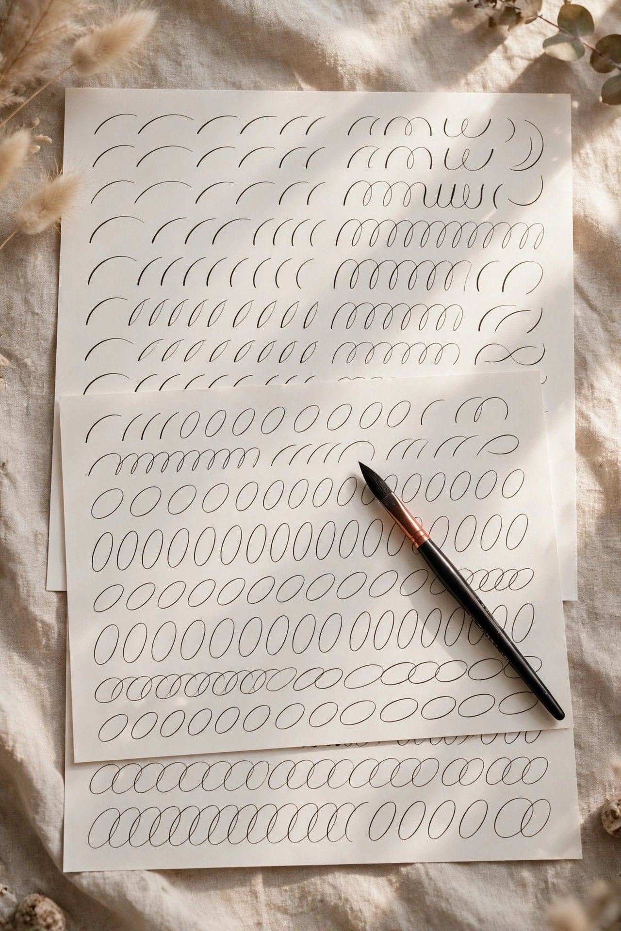
Couples successfully DIY the smaller pieces — place cards, signage, a welcome sign — with brush pens, practice drills, and four to eight weeks of regular sessions. The honest boundaries: envelope addressing for 150 guests is a marathon that punishes beginners, and formal copperplate takes far longer to make consistent. Start with brush calligraphy, letter your own names first (the highest-value practice), and keep professional help as the plan for the envelopes if time runs short.
Faux Calligraphy: The Clever Shortcut
 📌 Save
Faux calligraphy writes in any pen — even a ballpoint — then thickens only the downstrokes with a second pass, mimicking real pointed-pen contrast. With a fine liner and a steady template, it produces genuinely lovely place cards, labels, and signage, and it’s learnable in a weekend. It will not fool a calligrapher, but it fools every guest happily — and it is the fastest route to handmade charm on a deadline.
Calligraphy Fonts & Printing That Imitate the Hand
 📌 Save
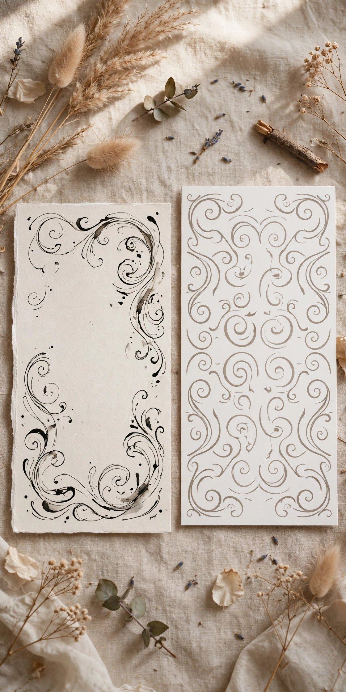
High-quality script fonts, printed digitally or even letterpressed, imitate calligraphy’s look at a fraction of the cost and with perfect consistency. They fool the eye in photographs better than in the hand — real calligraphy has micro-variation and ink texture print can’t copy — but for large lists and tight budgets, a beautiful font plus hand-lettered envelopes (or vice versa) is a smart allocation. Spend the hand where guests touch most.
Addressing Etiquette in Calligraphy
 📌 Save
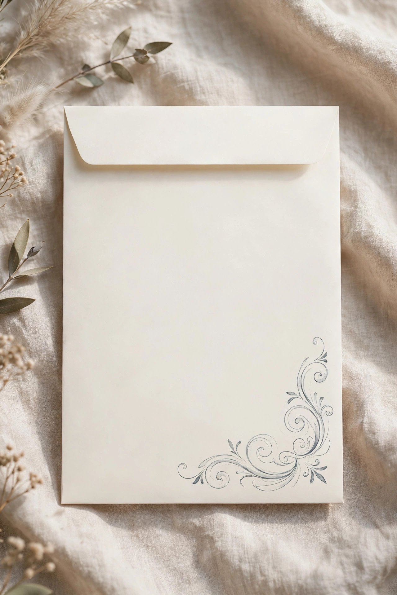
Calligraphed envelopes keep formal rules: full names with titles on the outer envelope, no abbreviations beyond Mr., Mrs., and Dr., and the inner envelope carrying the familiar form — “Mr. and Mrs. Reed,” “Aunt Helen,” plus children’s first names when invited. The calligrapher letters exactly the list you provide, so the etiquette homework — titles, name forms, who is invited — is the couple’s, done before the list is sent.
Timeline: When the List Must Be Final
 📌 Save
Work backwards: invitations mail six to eight weeks out; calligraphers typically need two to four weeks with the envelopes and final list (longer in peak season); so the guest list — names, titles, addresses, final counts — must be truly final about ten weeks before the wedding. Build the list in the calligrapher’s format from the start, because re-keying 150 addresses at deadline week is how errors (and tears) happen.
Calligraphy for Day-Of Details: Menus, Programs & Vows
 📌 Save
Beyond signage, calligraphers letter the intimate pieces: vow books (often heirloom-bound), menu headers or full menus for head tables, program covers, and reserved-seat signs. Your own vows, handwritten by a calligrapher into a bound book, become one of the wedding’s true heirlooms — and photographing them is a first-look favorite. Order these with the signage batch so the hand and inks match across the whole day.
Preserving Calligraphy: Keepsakes & Framing
 📌 Save
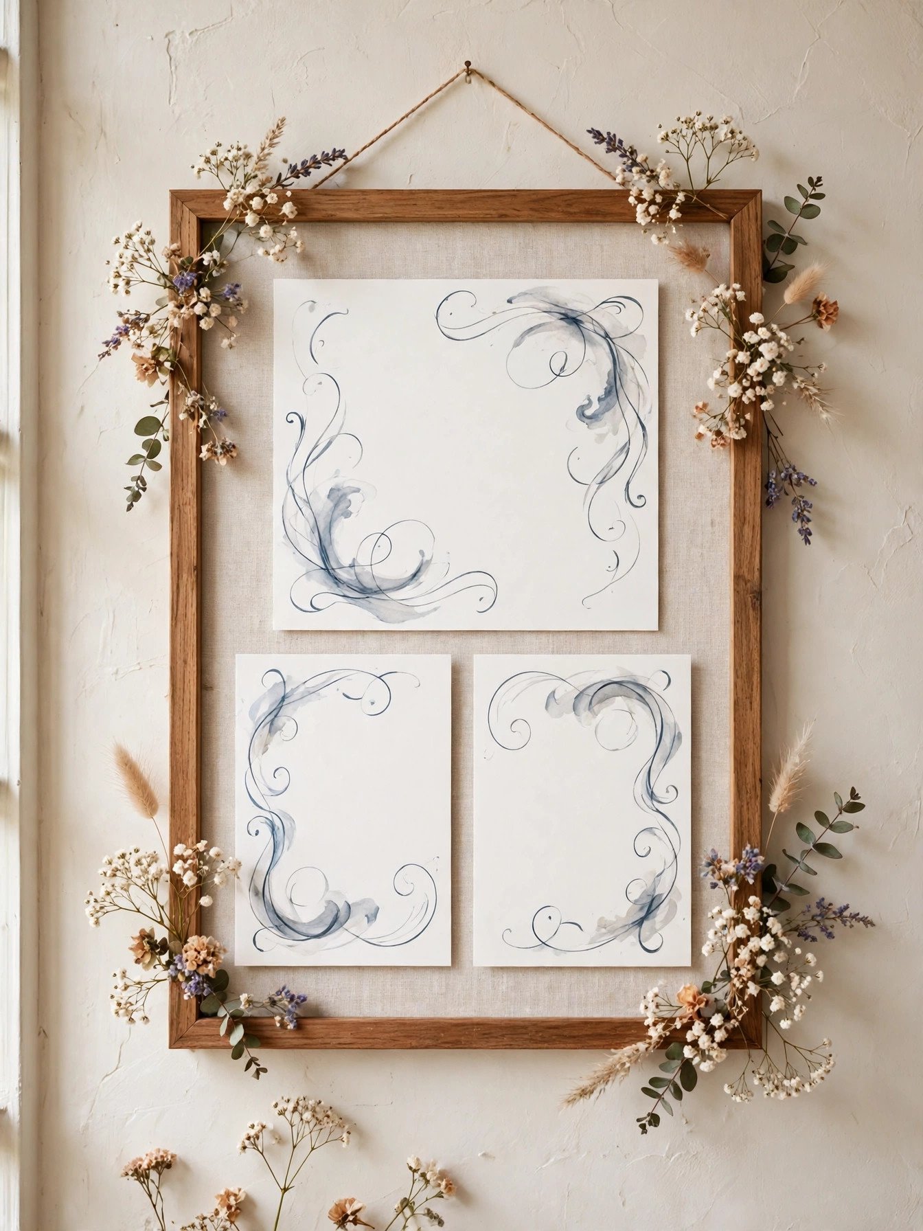
Commission one extra suite lettered for keepsakes: many couples frame the invitation with a calligraphed envelope beside it, or keep the suite in the wedding album’s first pocket. Use acid-free mats and UV glass if framing, store paper pieces flat and dark otherwise, and photograph everything at high resolution on the wedding day while the pieces are pristine — the digital copy outlives any frame.
Left-Handed, Accessibility & Reading the Script
 📌 Save
Two kindnesses hide in calligraphy choices. First, legibility: highly flourished scripts can defeat older eyes and guests reading a second language, so keep addresses in a clearer hand than names if your script runs swirly. Second, your calligrapher: left-handed artists underwrite or use bent nibs brilliantly — judge work, never handedness. The goal is a script every guest can actually read standing at the mailbox.
Common Calligraphy Mistakes (and Easy Saves)
 📌 Save
The classic mistakes: sending the list with inconsistent name forms; ordering exact-count envelopes (no spares for errors or additions); choosing metallic ink without a mail test; pairing rough handmade envelopes with a fine pointed pen; and booking the calligrapher after the invitations are designed, when name placement can’t accommodate script. Every one is prevented by the same trio: sample early, order spares, and plan the suite and the hand as one project.
Putting It Together: Your Calligraphy Plan
 📌 Save
Decide in order: the script family (formal copperplate, modern, brush, or broad-nib classic); the pieces it will grace (envelopes first, then names, then day-of); the ink palette against your envelope colors; professional or DIY per piece; and the budget and booking date that follow. Written down, those five decisions turn calligraphy from a vague longing into a booked, budgeted, beautiful plan.
Wedding Invitation Calligraphy FAQs
How much does wedding calligraphy cost?+
It varies by piece and style, but as a 2027 planning frame: outer-envelope addressing commonly costs a few dollars per envelope, with flourished scripts, metallic inks, and dark envelopes at the higher end; inner envelopes and place cards add smaller per-piece fees; signage is quoted per piece. Most couples find envelopes for a mid-size wedding land in the low hundreds — significant, but the most-touched luxury in the suite.
When should we book a calligrapher?+
As early as you book your stationer — popular calligraphers reserve peak spring and autumn dates six to twelve months out. The working timeline runs backwards from mailing: invitations post six to eight weeks before the wedding, and your calligrapher needs the final guest list and envelopes roughly two to four weeks before that, so lists must be final about ten weeks out.
Can we do our own calligraphy for our wedding?+
Yes, for the right pieces and with honest practice. Brush calligraphy and faux calligraphy are learnable in weeks and work beautifully for place cards, signage, and small details. Envelope addressing for a large list, and formal copperplate anywhere, reward professional hands — many couples split it: DIY the day-of pieces, hire the envelopes. Start practicing two to three months out on your real materials.
What is the difference between calligraphy and a script font?+
A script font is printed lettering designed to look handwritten — consistent, affordable, and convincing in photos. Real calligraphy is written by hand for each piece, with subtle ink texture and micro-variation no two envelopes share. Guests feel the difference in their fingers. Many suites mix both: a fine script font for the invitation body, real hand lettering for envelopes and names.
Which calligraphy style suits a formal wedding?+
Copperplate and related pointed-pen formal scripts are the traditional match for formal and black-tie weddings, especially with engraved or letterpress invitations. Italic and foundational broad-nib hands offer a quieter formality for literary or historic settings. The reliable rule: the formality of the hand should match the formality of the invitation it accompanies — when in doubt, show your calligrapher the suite design.
Key Takeaways
- Envelopes are calligraphy’s highest-impact job — if you hand-letter one thing, letter those.
- Match the script to the wedding: copperplate for formal, modern for relaxed, brush for bold, broad-nib for literary.
- Book early and finalize the guest list about ten weeks out; the calligrapher letters exactly the list you send.
- Always sample ink on your actual envelopes and mail-test metallics before the full run.
- DIY works for place cards and signage with brush or faux calligraphy — leave 150 envelopes to a practiced hand.
Final Thoughts
Calligraphy is the slowest, warmest technology in the wedding world: one person, one pen, your guests’ names written as if each were the only one. However much of it you commission or learn, the pieces it touches will be the pieces people keep.
Choose your script, book your hand, and send your list early — then enjoy the mailbox moment you’ve created for everyone you love.