7 Wedding Color Palettes: Jewel Tones
By zainzari • Published April 2026 • Updated October 9, 2026
 📌 Save
Jewel tones are rich, saturated colors inspired by gemstones — emerald, sapphire, ruby, amethyst, garnet and teal. The most stunning jewel tone wedding palettes for 2027 pair a deep gem color with a metallic or soft neutral: Emerald & Gold, Sapphire & Silver, Ruby & Blush, Amethyst & Champagne, Teal & Copper, and Garnet & Greenery. They bring drama, luxury and incredible photo depth to any season.
Pastels had their moment — but nothing makes a wedding feel luxurious quite like jewel tones. These deep, saturated colors borrowed from emerald, sapphire, ruby and amethyst bring instant richness to florals, table settings, stationery and attire. They glow under candlelight, photograph like a dream, and turn even a simple venue into something dramatic and unforgettable.
This 2027 guide walks you through 7 jewel tone wedding color palettes, each with styling ideas, flower suggestions and pro tips — plus a final section on how to mix multiple jewel tones without your wedding looking like a bag of marbles. Let’s find the palette that feels like you.
At a Glance: Jewel Tone Palettes by Mood & Season
| Palette | Mood | Best Season |
|---|---|---|
| Emerald & Gold | Luxurious and timeless | Fall / Winter |
| Sapphire & Silver | Elegant and serene | Winter / Spring |
| Ruby & Blush | Romantic and dramatic | Fall / Valentine’s season |
| Amethyst & Champagne | Whimsical and regal | Spring / Winter |
| Teal & Copper | Modern and warm | Fall / Summer |
| Garnet & Greenery | Moody and organic | Winter / Fall |
| Mixed Jewel Tones | Bold and festive | Any season |
Every jewel tone palette can work year-round with the right supporting colors — lighter neutrals for spring and summer, deeper companions for fall and winter.
Emerald & Gold
 📌 Save
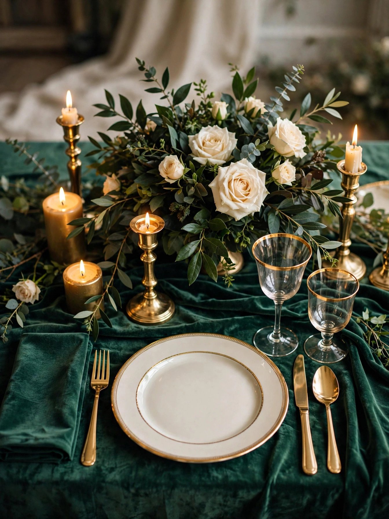
Deep emerald green paired with shimmering gold is the most timeless jewel tone combination of all.
Emerald and gold is the palette that never misses. The rich green reads luxurious in every setting — velvet table runners, emerald bridesmaid dresses, lush garden-rose centerpieces — while gold flatware, candlesticks and charger plates add warmth and light. Under candlelight, this combination practically glows, which is why it dominates fall and winter weddings.
Build the palette with emerald taper candles, gold-rimmed glassware and stationery printed in gold foil on deep green cardstock. For florals, ask for dark greenery like smilax and Italian ruscus mixed with ivory blooms — the greenery itself carries the emerald tone. A little goes a long way: even gold accents against an ivory base with emerald florals will read unmistakably luxe.
Read next: 25 Elegant Indoor Wedding Reception Ideas
Sapphire & Silver
 📌 Save
Sapphire blue with silver accents creates a serene, sophisticated palette with serious evening glamour.
Where emerald feels warm and opulent, sapphire feels cool and refined. This palette shines at winter weddings — midnight-blue velvet linens, silver candelabras, blue delphinium and thistle in the florals — and looks stunning against falling snow or a city skyline at night. Silver keeps it luminous where gold would feel heavy.
Style it with navy or cobalt bridesmaid dresses, silver sequin or mercury-glass table accents, and stationery in silver foil on midnight-blue paper. For a spring version, lighten the supporting cast: sapphire blooms against pale blue and ivory, with silver used sparingly. The key is contrast — deep blue needs light around it to breathe.
Read next: 27 Rustic Wedding Decoration Ideas
Ruby & Blush
 📌 Save
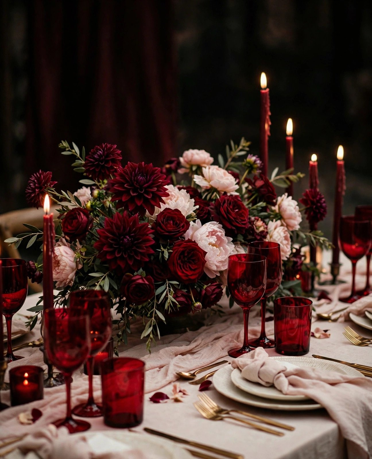
Deep ruby red softened with blush pink is romance with an edge — perfect for couples who want drama without darkness.
Ruby and blush is the palette for hopeless romantics with a bold streak. The blush keeps everything soft and feminine — blush linens, pale pink roses, delicate stationery — while ruby adds passion and depth: burgundy dahlias, deep red garden roses, ruby glassware, a dramatic red bouquet. Together they create that coveted “moody romantic” look all over Pinterest.
This combination is made for fall weddings and Valentine’s-season celebrations, but it works in summer too if blush leads and ruby accents. Try blush bridesmaid dresses in different shades with a ruby bouquet, or an ivory-and-blush tablescape punctuated with dark red candles and wine glasses. The contrast photographs beautifully in golden-hour light.
Read next: 300 Heartfelt Wedding Vows
Amethyst & Champagne
 📌 Save
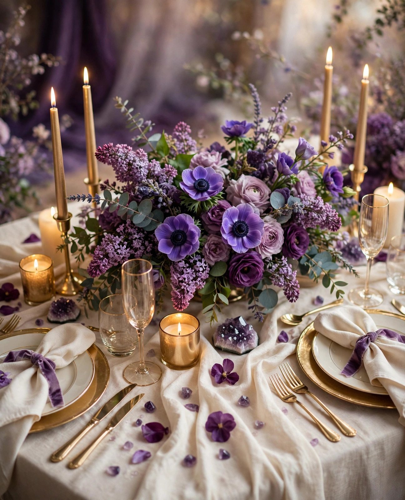
Violet amethyst tones lifted by warm champagne create a palette that is regal, dreamy and endlessly versatile.
Amethyst sits between purple’s royalty and lavender’s softness, which makes it the most flexible jewel tone on this list. Paired with champagne — the warmest, most forgiving neutral — it works for spring garden weddings (lilac, lavender and plum blooms against champagne linens) and winter celebrations alike (deep purple velvet with glowing champagne candles).
Lean into the range: use the full purple spectrum from pale lilac to deep plum in your florals for an ombré effect, and let champagne carry the metallics — champagne gold flatware, candles and stationery foil. Amethyst bridesmaid dresses in mismatched shades look stunning, and purple anemones or lisianthus make unforgettable bouquets.
Read next: 12 Budget Wedding Plans That Look Expensive
Teal & Copper
 📌 Save
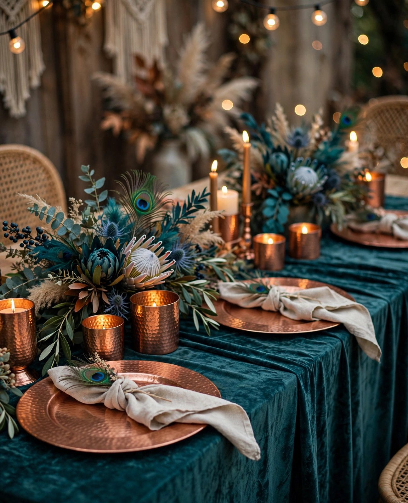
Teal’s cool, peacock-like depth against warm copper is the most modern pairing in the jewel tone family.
Teal and copper is for couples who want jewel tones without the traditional feel. Teal brings depth and a hint of the exotic — think peacock feathers, deep turquoise glassware, teal velvet lounge furniture — while copper adds industrial warmth: hammered copper chargers, geometric terrariums, Edison-bulb lighting. Together they feel contemporary, artistic and a little bit bohemian.
This palette is a natural fit for fall weddings (teal with copper and warm neutrals is pure autumn sophistication) and for loft, barn or desert venues where the copper tones echo the setting. Style stationery in copper foil on deep teal, dress the wedding party in teal shades, and let copper candlelight do the warming work after dark.
Read next: 36 Ways to Slash Your Wedding Budget
Garnet & Greenery
 📌 Save
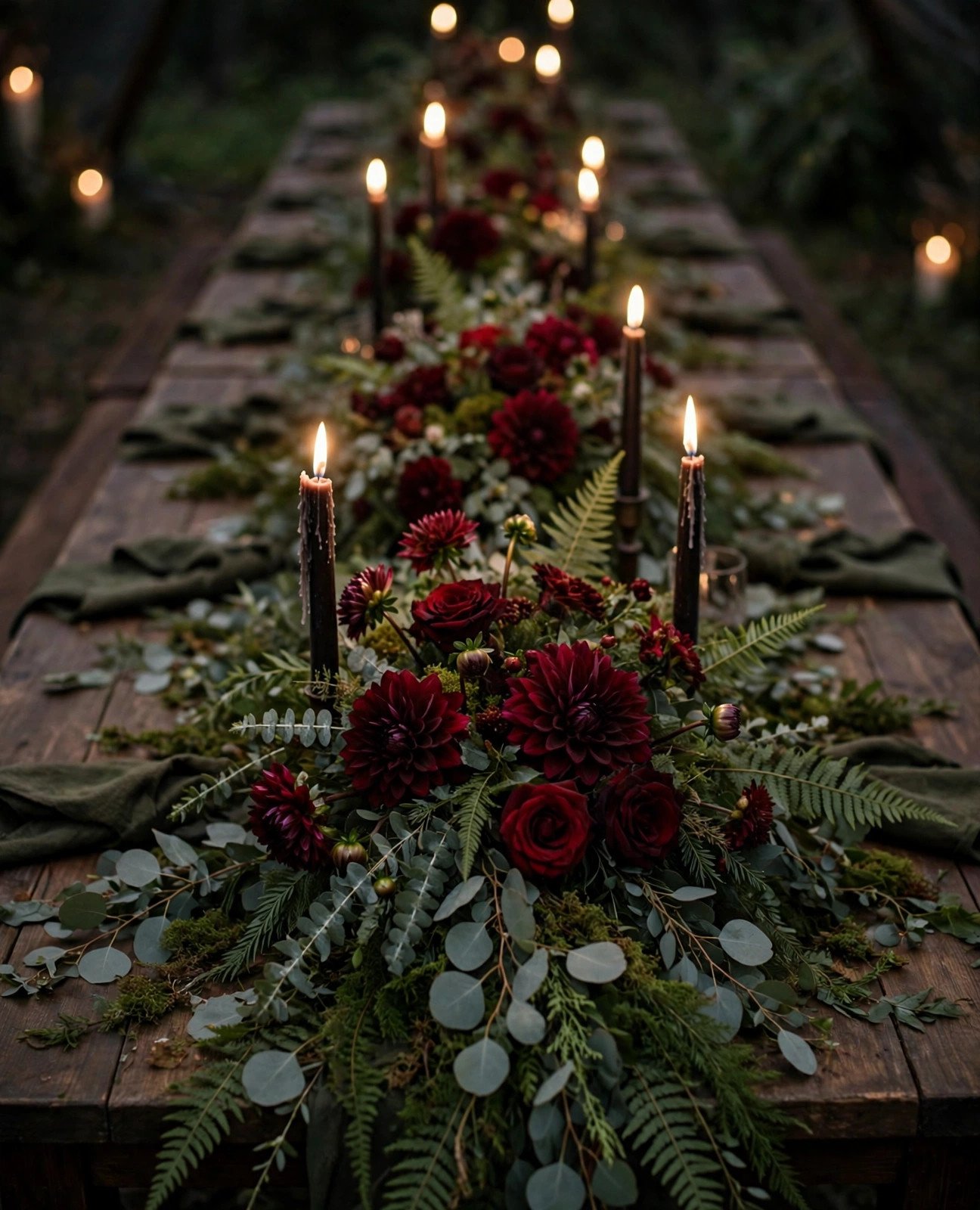
Deep garnet reds nestled into abundant greenery create the moodiest, most organic palette on this list.
Garnet and greenery is jewel tones gone wild — in the best way. Instead of metallics, the “second color” here is nature itself: eucalyptus garlands, olive branches, ferns and smilax in abundance, punctuated with garnet blooms like burgundy dahlias, dark red roses and black scabiosa. The result feels like a secret garden at dusk — romantic, a little mysterious, completely unforgettable.
This palette is made for winter and late-fall weddings, where the greenery echoes the season and candlelight makes the garnet tones smolder. Build long garland runners down banquet tables, hang greenery installations overhead, and let dark taper candles add the only metallic-free drama you need. It is also one of the most budget-friendly jewel palettes — greenery costs far less than blooms.
Read next: Ultimate Wedding Planning Checklist
Mixing Jewel Tones Like a Pro
 📌 Save
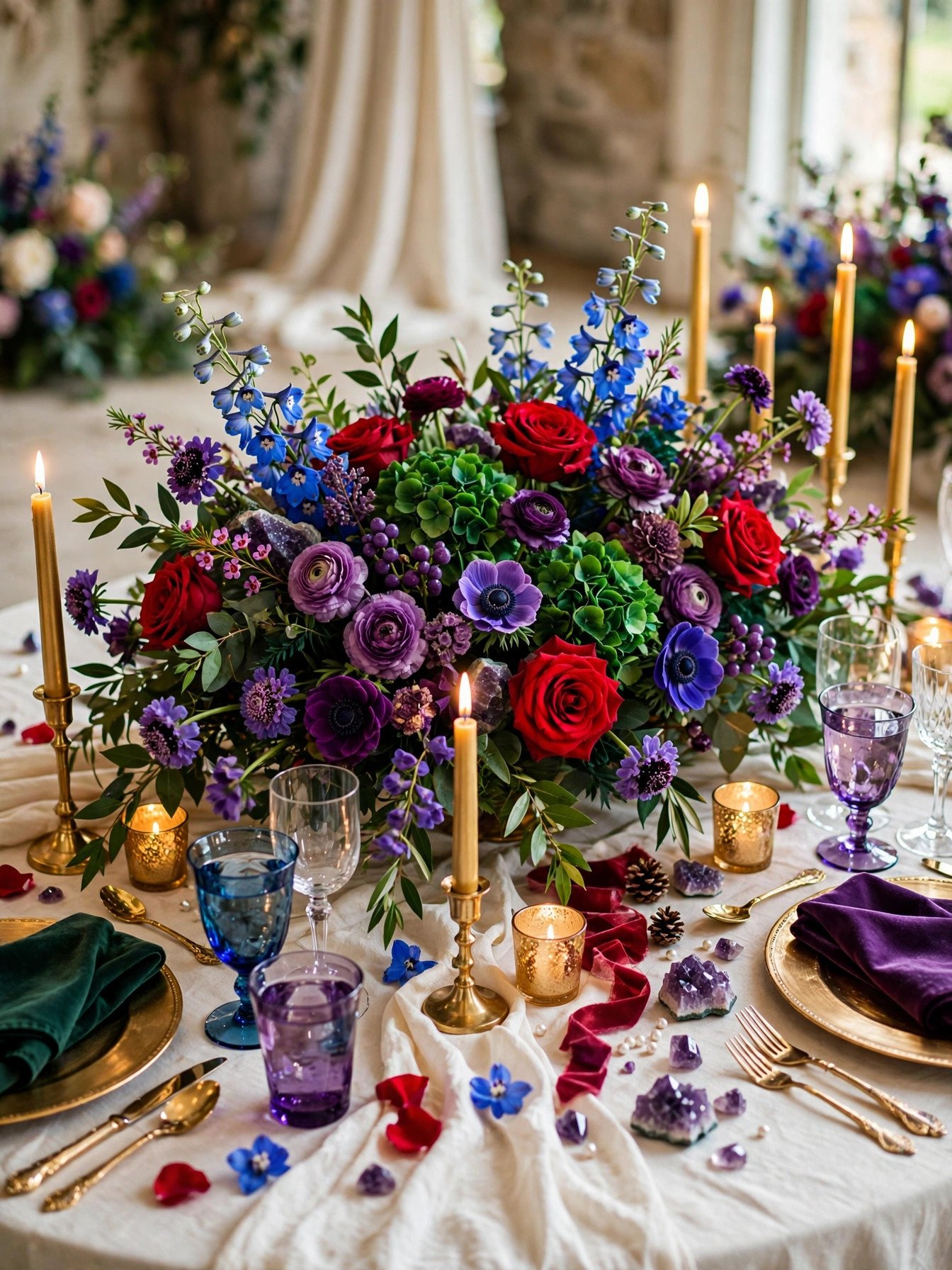
Love them all? A mixed jewel tone palette — emerald, sapphire, ruby and amethyst together — is bold, festive and totally doable with the right formula.
The secret to mixing jewel tones is the 60-30-10 rule: let one jewel tone dominate about 60% of your décor, give a second tone 30%, and use a metallic or neutral — gold, champagne or ivory — for the final 10% that ties everything together. Equally important: keep every jewel tone at the same saturation level. Colors that are all equally rich and deep feel intentional; one pastel sneaking in will look like a mistake.
Anchor the mix with neutrals so it feels curated, not chaotic. Ivory linens, champagne candles and natural wood or greenery give the eye somewhere to rest between the rich colors. Try it in the florals first — a bouquet or centerpiece blending emerald greenery, ruby roses, sapphire thistle and plum dahlias — then echo the mix in bridesmaid dresses (mismatched jewel tones are stunning) and stationery.
Frequently Asked Questions
What are jewel tones in wedding décor?
Jewel tones are rich, saturated colors inspired by gemstones — emerald, sapphire, ruby, amethyst, garnet and topaz. In wedding décor they bring depth, drama and luxury that pastels cannot match. They work beautifully in florals, table linens, stationery, bridesmaid dresses and candlelight, and they photograph gorgeously in both daylight and evening settings.
Which jewel tone palette is best for a fall or winter wedding?
Emerald & Gold and Garnet & Greenery are the top picks for fall and winter weddings — their deep, warm richness suits shorter days and candlelit receptions perfectly. Sapphire & Silver is a stunning winter choice too, especially for December weddings, while Ruby & Blush brings festive drama to holiday-season celebrations.
How do I mix jewel tones without the colors clashing?
Follow the 60-30-10 rule: let one jewel tone dominate (60%), a second support it (30%), and use a metallic or neutral as the 10% accent. Keep all your jewel tones at the same saturation level — equally rich and deep — and anchor everything with neutrals like ivory, charcoal or champagne so the colors feel curated, not chaotic.
Can I use jewel tones for a spring or summer wedding?
Absolutely. Pair jewel tones with lighter companions to keep them season-appropriate: amethyst with champagne for spring, teal with copper for summer, or ruby with blush for a romantic warm-weather look. Use jewel tones as accents — in the bouquet, stationery or bridesmaid dresses — against airy neutrals and greenery so the palette feels fresh rather than heavy.
What flowers come in jewel tone colors?
Great jewel-tone flowers include burgundy dahlias, deep red garden roses, plum calla lilies, purple anemones, dark blue delphinium, magenta peonies, black-eyed scabiosa and chocolate cosmos. Ask your florist for dyed or tinted blooms too — many classic flowers can be tinted to exact jewel shades like emerald or sapphire that do not occur naturally.
✨ Key Takeaways
- Jewel tones — emerald, sapphire, ruby, amethyst, garnet, teal — bring unmatched richness and drama to wedding décor.
- Pair every deep jewel tone with a metallic or soft neutral (gold, silver, champagne, blush) so the palette glows instead of feeling heavy.
- Emerald & Gold is the most timeless pairing; Teal & Copper is the most modern.
- When mixing multiple jewel tones, use the 60-30-10 rule and keep all colors equally saturated.
- Jewel tones work in every season — lighten the supporting colors for spring and summer, deepen them for fall and winter.
Final Thoughts
Choosing a jewel tone palette is really choosing a feeling: the candlelit opulence of Emerald & Gold, the cool serenity of Sapphire & Silver, the moody romance of Garnet & Greenery. Whichever of these 7 palettes speaks to you for your 2027 wedding, remember that jewel tones reward commitment — go rich, go deep, and let the color do the talking. Your photos (and your guests) will thank you for decades.