20 Letterpress Wedding Invitations (2027)
By zainzari • Published October 23, 2026 • Updated October 23, 2026
 📌 Save
Letterpress invitations are printed by pressing an inked, raised plate into soft cotton paper, leaving a deep, tactile impression you can feel with a fingertip. The 20 designs below span classic formal suites, botanical and garden styles, modern minimal pieces, and foil-paired showstoppers — each described with its papers, inks, and the wedding it suits, plus the practical details (colors are priced per ink, and thick cotton stock is non-negotiable).
Letterpress is the oldest printing method in the wedding world and still the most loved, for one simple reason: guests run a thumb across it. That little valley of ink pressed into cotton is something no screen or flat print can imitate.
Browse these 20 designs by mood — formal, romantic, modern, rustic — noting the paper and ink details on each card. Pricing reality to hold in mind: every ink color needs its own plate and press pass, so one- and two-color designs are where letterpress value lives.
At a Glance: Each Design, Its Palette & Its Wedding
| # | Design | Palette & Paper | Best For |
|---|---|---|---|
| 1 | The Classic Cotton Suite: Navy Ink on Bright White | Navy on white cotton | Formal & black-tie |
| 2 | Blush & Gold: Letterpress Names With Foil Details | Blush + gold foil on cotton | Romantic formal |
| 3 | Botanical Line-Art Suite in Sage Green | Sage on warm white cotton | Garden & greenhouse |
| 4 | Modern Minimal: Black Ink, Huge Type | Black on white cotton board | City & gallery weddings |
| 5 | Vintage Typewriter & Mixed-Type Suite | Charcoal & rust on cream | Vintage & historic venues |
| 6 | Blind Impression (No Ink): Pure Texture | Uninked impression on cotton | Minimalist luxury |
| 7 | French-Inspired Suite With Script Flourishes | Dove grey on soft white | Château & fine-art |
| 8 | Nautical Navy & White With a Rope Border | Navy on white cotton | Coastal formal |
| 9 | Desert Suite: Terracotta & Clay Inks | Terracotta & clay on sand cotton | Desert & Southwest |
| 10 | Black Paper, White Ink: The Dramatic Inverse | White on black cotton | Evening & winter glam |
| 11 | Wildflower Meadow Suite in Two Colors | Two inks on cream cotton | Farm & countryside |
| 12 | Art Deco Suite: Geometric Borders in Black & Gold Ink | Black & gold ink on ivory | Historic hotel glam |
| 13 | Watercolor-Wash Background With Pressed Type | Wash + ink on cotton | Fine-art & garden |
| 14 | Monogram Crest Suite: The Family-Heirloom Look | Ink or blind crest on cotton | Traditional formal |
| 15 | Rustic Kraft & Cream Letterpress | Cream & chocolate on kraft cotton | Barn & country |
| 16 | Two-Ink Ombre Sky Suite | Blended inks on white cotton | Sunset & coastal |
| 17 | Letterpress With Edge Painting & Silk Ribbon | Two inks, painted edge, silk | Luxury romantic |
| 18 | Small & Mighty: The Intimate Letterpress Card | One ink on cotton | Micro-weddings |
| 19 | Letterpress + Calligraphy: Pressed Print, Handwritten Names | Ink + hand script on cotton | Bespoke luxury |
| 20 | Ordering Letterpress Well: Timeline, Proofs & Spares | Process guide | Every letterpress couple |
Letterpress loves cotton paper of 300 gsm and up. If a design tempts you, run a fingertip across a sample — the impression depth is the quality test.
The Classic Cotton Suite: Navy Ink on Bright White
 📌 Save
The definitive letterpress invitation: traditional serif type in deep navy ink pressed into bright white 100% cotton paper, formal wording, a thin keyline border, and nothing else. Its confidence comes from restraint — the deep, even impression and the ink’s slight sheen against matte cotton do all the showing off. Perfect for church, ballroom, and black-tie weddings.
Blush & Gold: Letterpress Names With Foil Details
 📌 Save
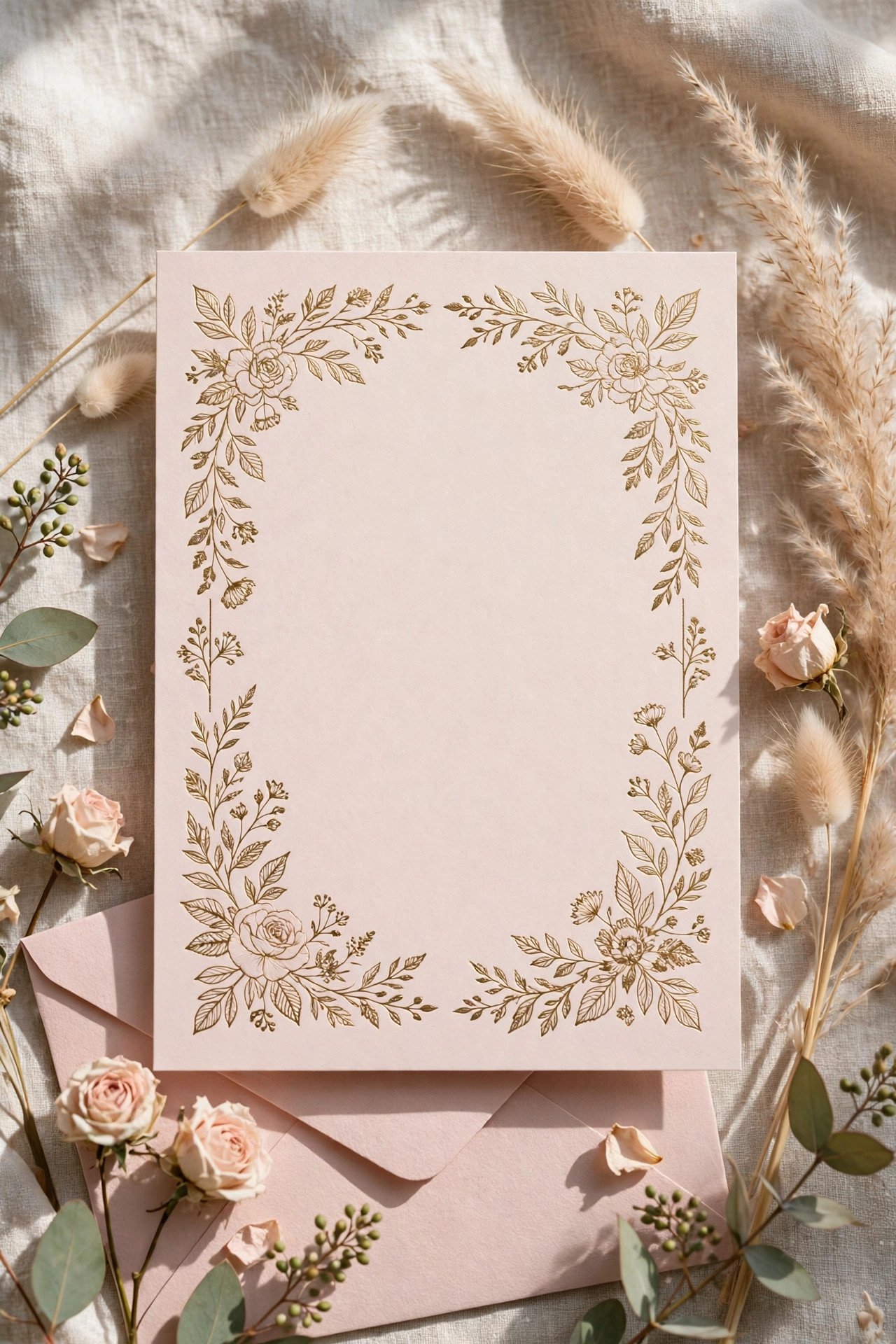
A hybrid showpiece: the body text is letterpressed in a dusty blush ink on soft white cotton, while the couple’s names are foil-stamped in gold so they catch the light above the pressed text. The two techniques complement rather than compete — matte depth below, gleam above. A favorite for romantic ballroom and garden-estate weddings.
Botanical Line-Art Suite in Sage Green
 📌 Save
Delicate botanical line drawings — eucalyptus, ferns, and climbing roses — letterpressed in sage green around classic type. Line art is letterpress’s best friend: every fine stem presses crisply, and the single ink color keeps both the price and the palette serene. Printed on warm white cotton, this suite feels like a page from a beloved gardening book.
Modern Minimal: Black Ink, Huge Type
 📌 Save
Contemporary letterpress at its boldest: the couple’s names set huge in a clean sans or slab, black ink, vast white space, details small and quiet below. The deep impression keeps minimalism from feeling cold — the paper itself becomes the texture. Extra-thick cotton (500+ gsm) suits this design, since the sheet is practically a character in it.
Vintage Typewriter & Mixed-Type Suite
 📌 Save
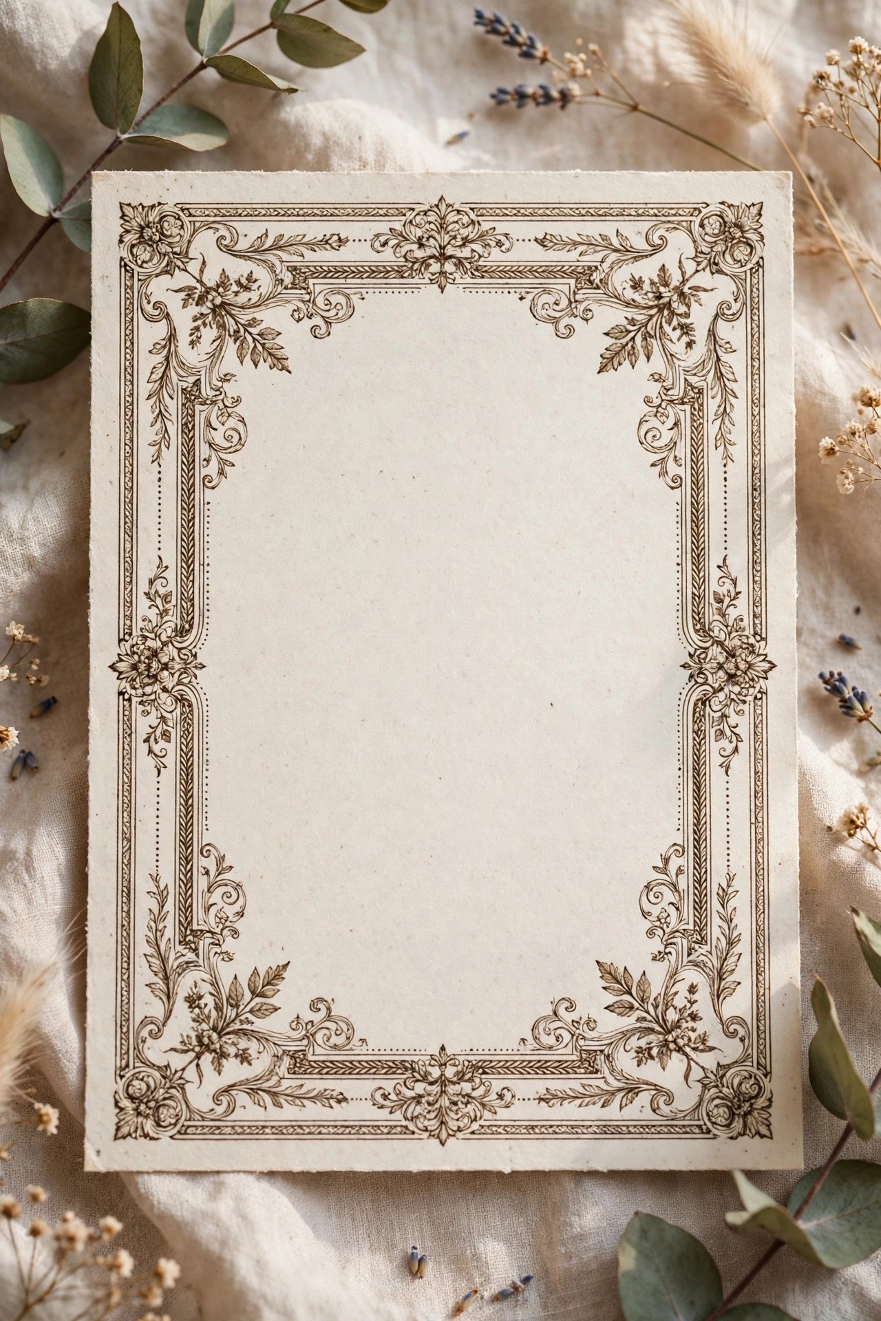
Letterpress was born for this: a playful mix of vintage display faces, a typewriter font for details, and small ornament rules, printed in charcoal and rust inks on cream cotton. On a real press — especially a vintage one — the slight irregularities of impression become charm rather than error. Ideal for speakeasy, literary, and historic-venue weddings.
Blind Impression (No Ink): Pure Texture
 📌 Save
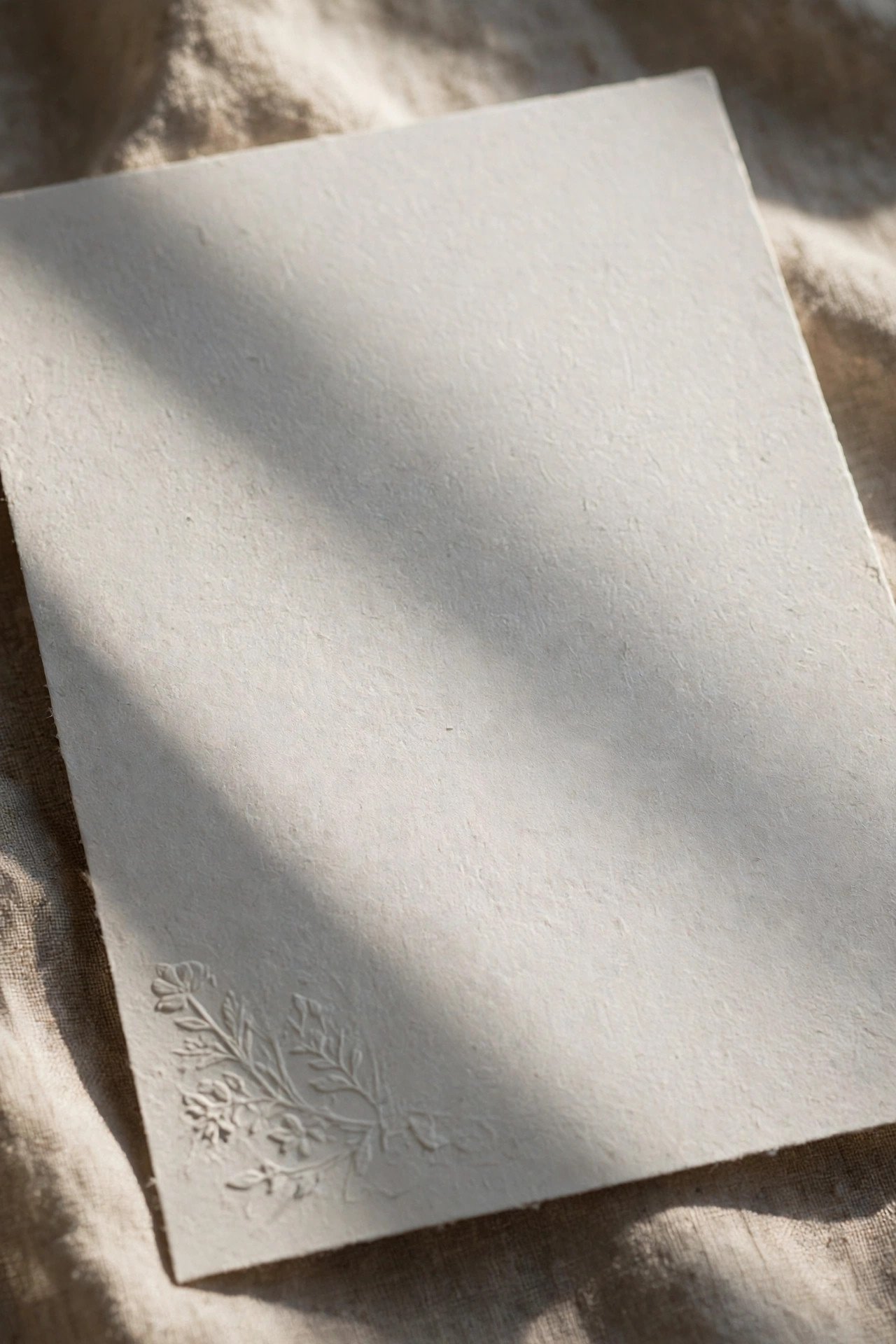
Blind letterpress presses the plate without ink, leaving a sculptural impression — a monogram, a floral field, or the couple’s names — visible in raking light. Usually paired with a small amount of inked text, it is the most understated luxury in stationery: guests discover the design by touch before they see it. Thick, soft cotton is essential; the paper is the ink.
French-Inspired Suite With Script Flourishes
 📌 Save
Flowing calligraphic script for the names, small caps for the details, and a flourish that swirls across the corner, all pressed in soft dove-grey with optional pale gold accents. French-inspired suites suit château, garden, and fine-art weddings, and they pair naturally with deckled or gilt edges and silk ribbon.
Nautical Navy & White With a Rope Border
 📌 Save
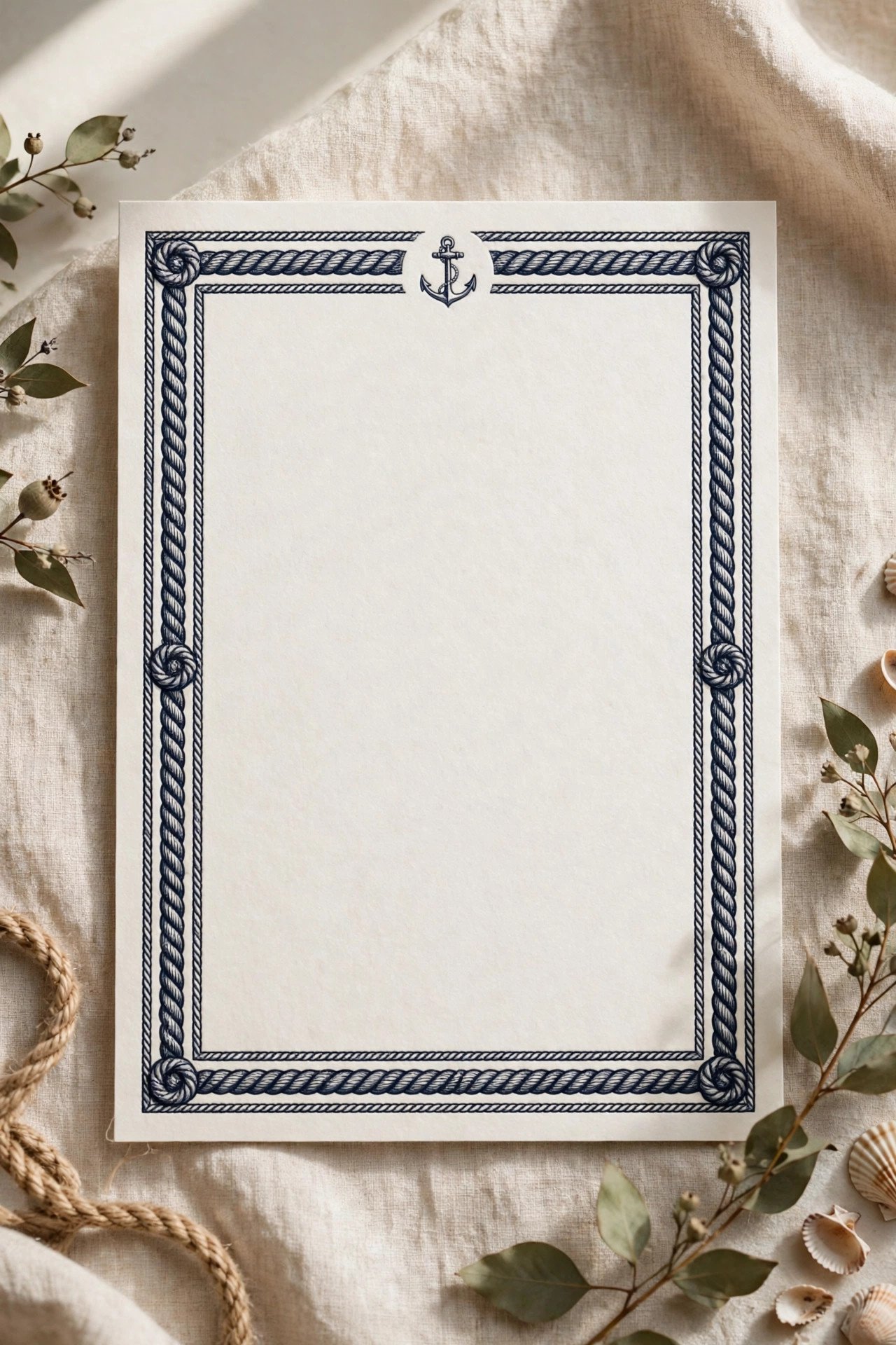
For coastal weddings that still want gravitas: navy letterpress on white cotton, a finely pressed rope border, a small anchor or compass monogram, and classic formal wording. The border presses beautifully — repetitive fine patterns are where letterpress shows off — and the suite reads yacht-club elegant rather than beach-party casual.
Desert Suite: Terracotta & Clay Inks
 📌 Save
Terracotta and clay inks on warm sand-toned cotton, an arch motif pressed above the names, and relaxed modern type: the desert suite translates a landscape into letterpress. Earthy inks sit beautifully in cotton’s soft surface, and a blind-pressed arch or sun on the RSVP card carries the theme through the suite.
Black Paper, White Ink: The Dramatic Inverse
 📌 Save
Most letterpress assumes dark ink on light paper; inverting it — opaque white ink pressed into black or charcoal cotton — creates a moody, unforgettable suite for evening, winter, and modern-glam weddings. White ink needs two press hits to reach full opacity, and printers who do it well are worth seeking out. Foil is the alternative many couples choose for black paper, but true pressed white has a matte softness foil can’t copy.
Wildflower Meadow Suite in Two Colors
 📌 Save
Scattered wildflower illustrations pressed in two inks — say, cornflower blue and butter yellow, or poppy red and leaf green — around friendly type on cream cotton. Two-color botanical work has a storybook quality, like a vintage seed packet, and suits farm, meadow, and countryside weddings beautifully. The second color is placed only in the artwork, keeping text calm and readable.
Art Deco Suite: Geometric Borders in Black & Gold Ink
 📌 Save
Stepped geometric borders, radiating sunbursts, and tall deco lettering pressed in black ink on ivory cotton, with the couple’s monogram crest picked out in a second gold-ink pass. Deco designs are built from exactly the crisp lines and bold shapes letterpress renders best. Made for historic hotels, theaters, and Gatsby-hearted couples.
Watercolor-Wash Background With Pressed Type
 📌 Save
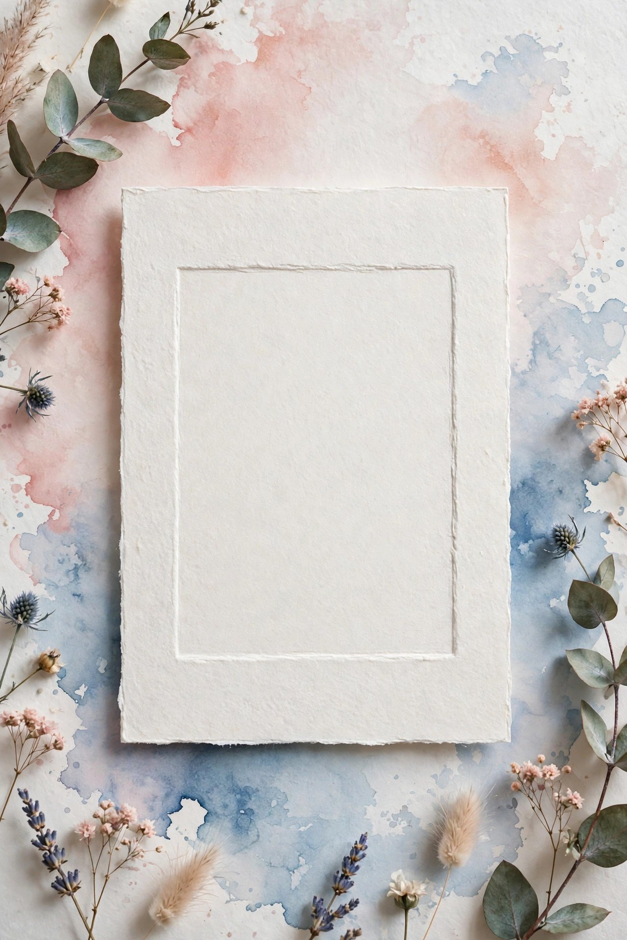
A soft watercolor wash — blush, sky, or sage — is flat-printed or hand-applied first; the letterpress plate then presses the text into the painted surface, so the words sit in little valleys across the color. The combination feels like an artwork that happens to be an invitation, and it is a fine-art wedding favorite from Charleston to the Cotswolds.
Monogram Crest Suite: The Family-Heirloom Look
 📌 Save
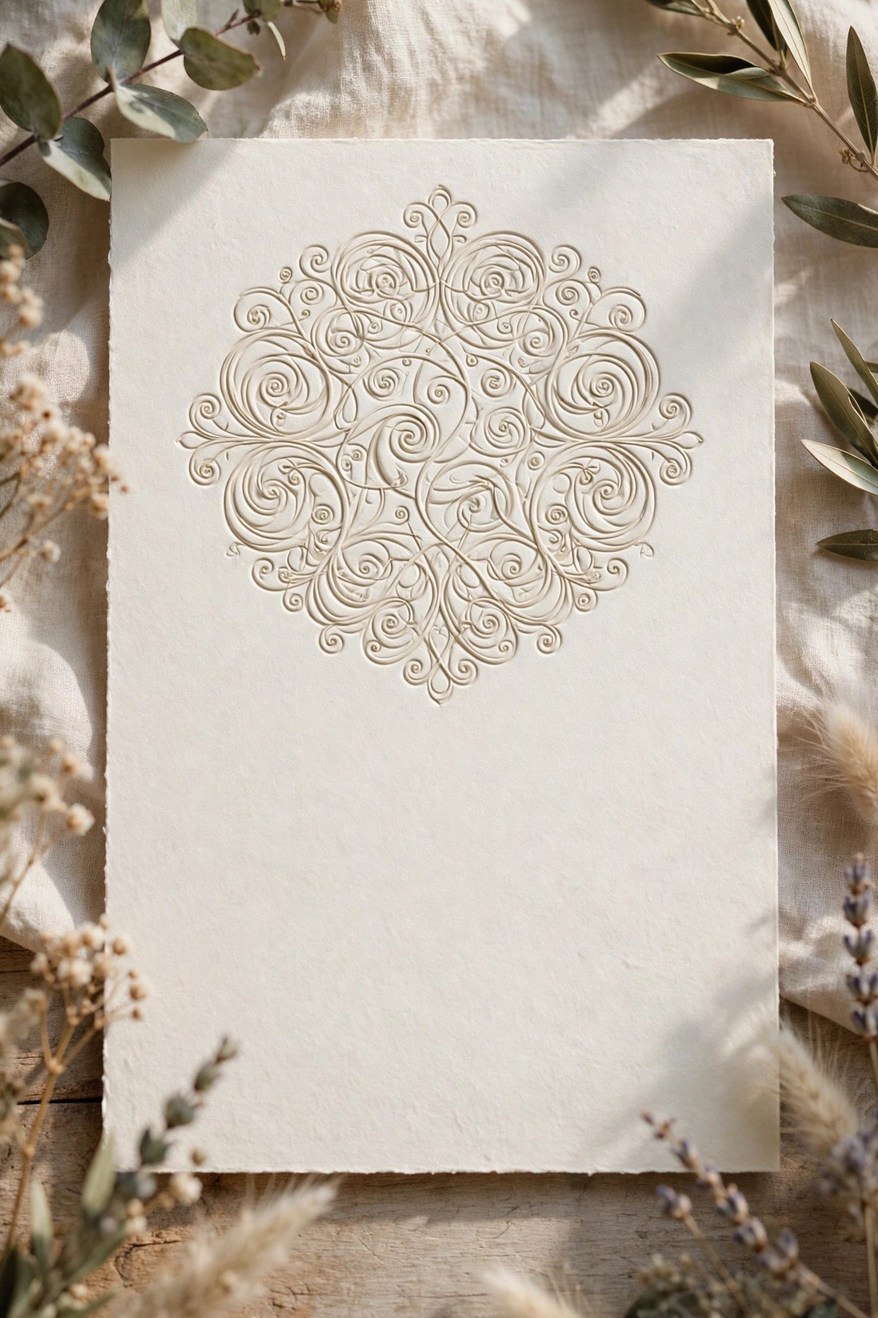
A custom interlocked monogram, pressed large at the head of the invitation (inked or blind), with formal wording below in classic type. Couples often commission the crest as vector artwork so it can recur on menus, napkins, and signage for the couple’s whole entertaining life. On thick cotton with a gilt or painted edge, this is the suite most likely to be framed by mothers.
Rustic Kraft & Cream Letterpress
 📌 Save
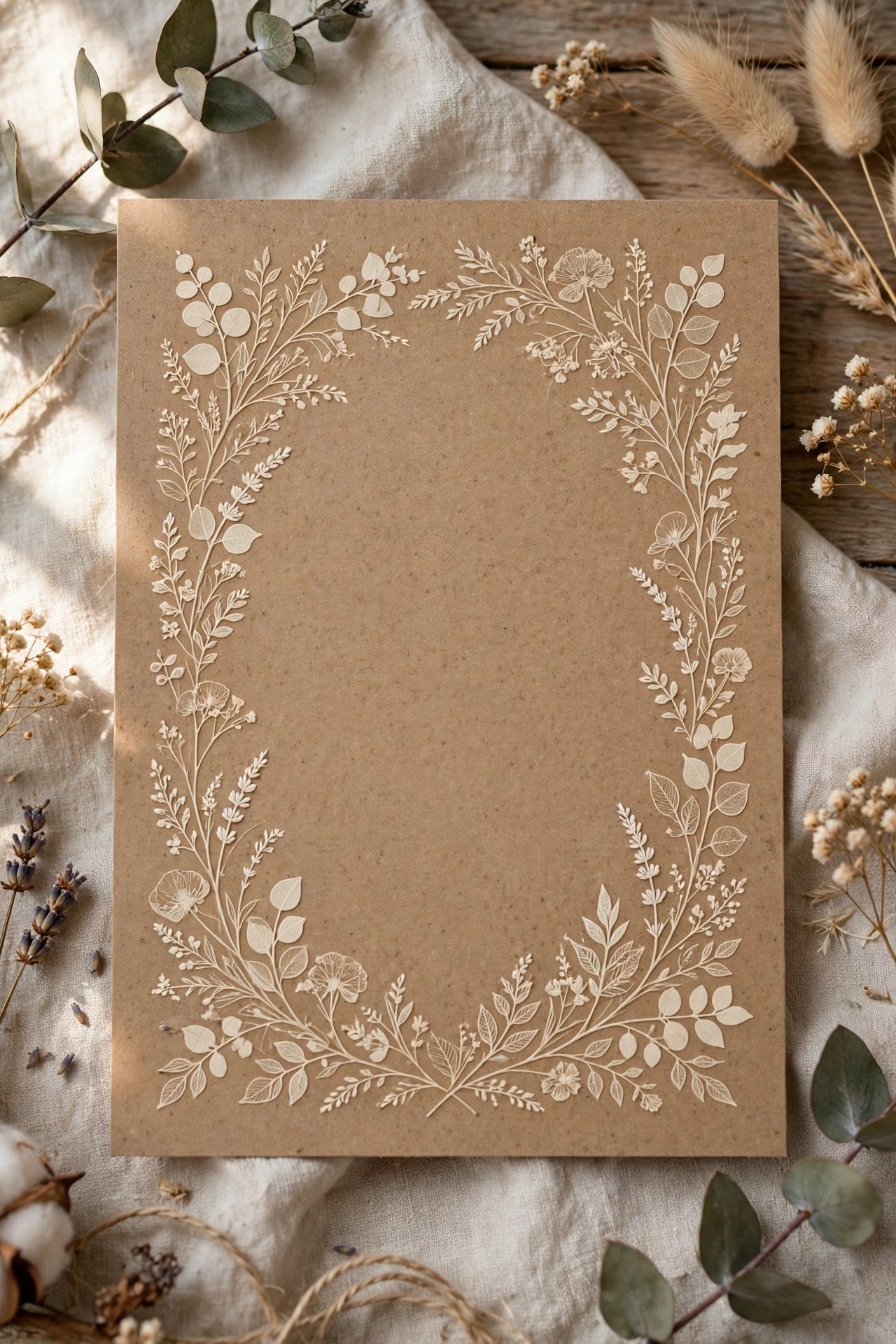
Kraft-toned cotton paper (or cream paper with kraft envelopes) pressed with cream and chocolate inks: typewriter details, a laurel motif, and wording as warm as the venue. Letterpress elevates rustic design beyond the expected — the impression gives barn-wedding paper a craft and permanence that flat-printed kraft can’t reach.
Two-Ink Ombre Sky Suite
 📌 Save
Split-fountain printing places two inks on the same plate so they blend where they meet — deep blue fading to soft sky, plum into blush. Applied to a headline, a horizon motif, or an entire border, it gives letterpress a painterly gradient flat printing can’t mimic, because no two impressions blend in quite the same place. Sunset, coastal, and mountain weddings wear it beautifully.
Letterpress With Edge Painting & Silk Ribbon
 📌 Save
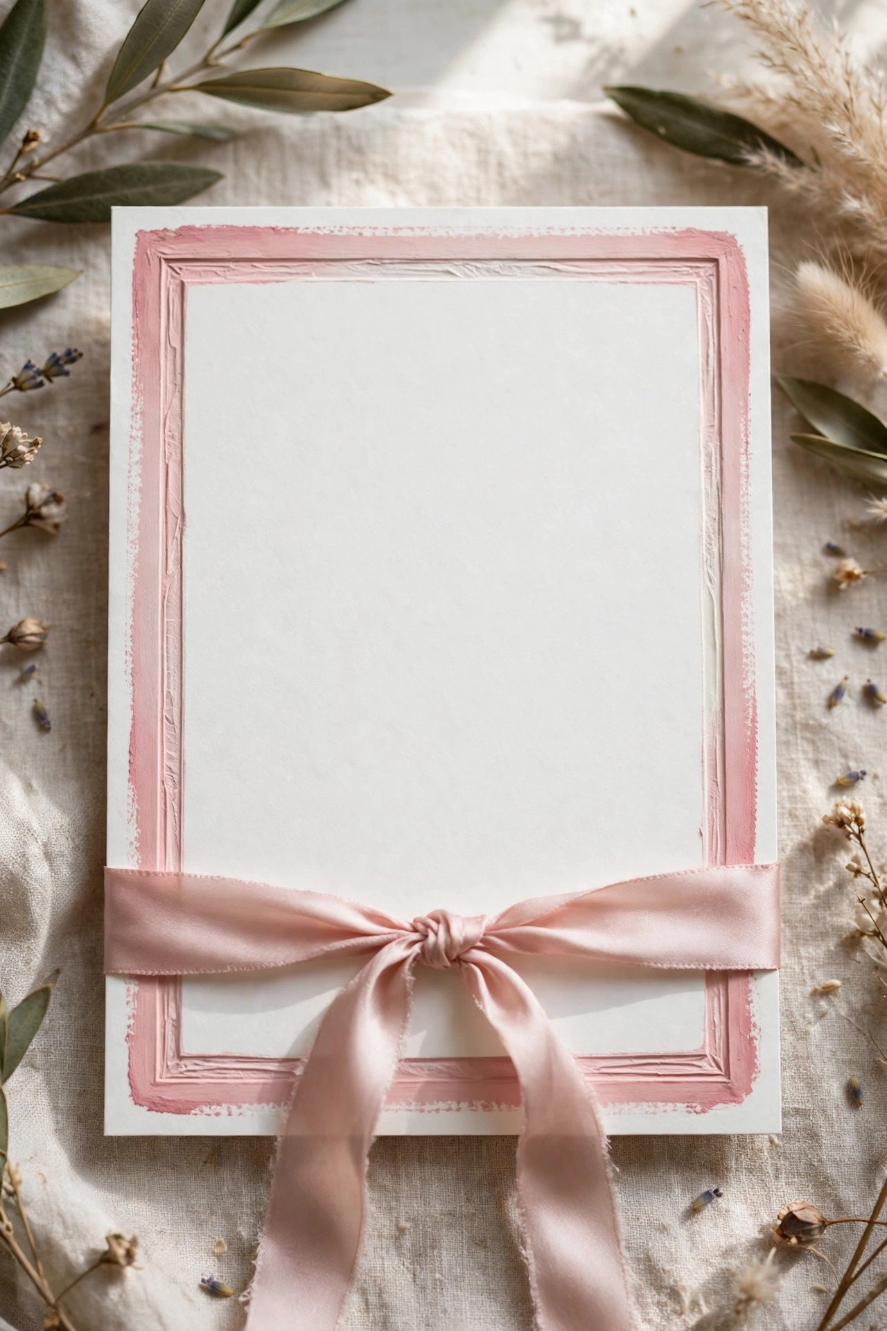
The finishing suite: two-color letterpress on double-thick cotton, edges hand-painted in a palette color, the suite gathered with a vellum wrap and hand-dyed silk ribbon. Each finishing step is a separate craft and a separate line item — but together they produce the invitation guests photograph, keep, and describe to other people. This is letterpress as the main event.
Small & Mighty: The Intimate Letterpress Card
 📌 Save
Letterpress pricing scales with size and ink count, so a smaller-format invitation — a petite card with one ink color — delivers the full tactile experience at a gentle price, and suits micro-weddings poetically: twenty guests, twenty little works of art. The wording tightens to essentials and the website carries the rest.
Letterpress + Calligraphy: Pressed Print, Handwritten Names
 📌 Save
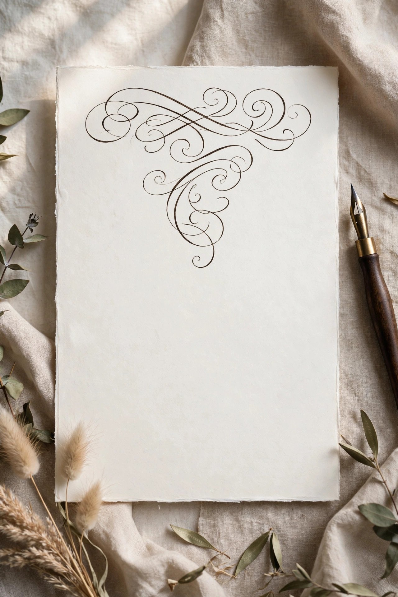
The bespoke summit: the invitation body is letterpressed, and the couple’s names are left blank for a calligrapher to hand-letter on every single invitation. No two are identical, the script has breath in it, and the contrast between pressed precision and human hand is exquisite. Timelines stretch (the calligrapher works after printing) and so does the budget — for couples who care most, it’s the point.
Ordering Letterpress Well: Timeline, Proofs & Spares
 📌 Save
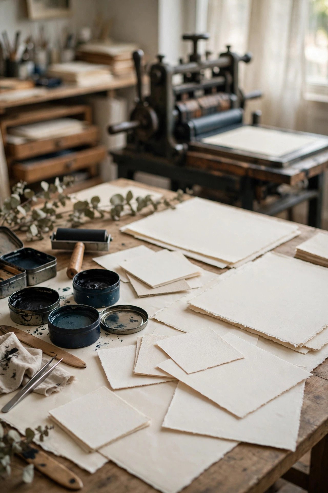
Letterpress is a physical craft with a physical timeline: design and plate-making, a printed proof (insist on one, on your paper), then printing one color at a time with drying between passes. Allow six to ten weeks from design approval to delivery for multi-piece suites. Order 10–15 spare invitations and envelopes beyond your count — reprints mean new setups and are brutally expensive compared with spares bought in the run.
20 Letterpress Wedding Invitations FAQs
How much do letterpress invitations cost?+
Letterpress sits in the premium tier because each ink color needs its own plate and press pass, and cotton paper costs more than standard cardstock. One-color designs on quality cotton are the value entry point; expect costs to climb with each added color, thicker duplexed boards, foil pairing, and finishing like edge painting. As a planning frame, couples typically budget several times the cost of a comparable flat-printed suite — and order spares in the first run, since reprints are disproportionately expensive.
How many ink colors should a letterpress design use?+
One or two. Letterpress pricing is per color, and the technique’s charm — deep impression, matte ink on soft cotton — is fully present in a single color. A second color is best spent on one element: the names, a botanical illustration, or a crest. Three or more colors are possible but rarely look better than a disciplined two, and they multiply both cost and registration risk.
What paper does letterpress require?+
Soft, thick, uncoated paper — classically 100% cotton at 300 gsm or above, with 500–600 gsm duplexed boards for luxury suites. The plate must physically press into the sheet, so glossy coated papers crack, thin papers bruise through, and hard sized papers resist the impression. Your printer will have house cotton stocks they know intimately; start from their samples.
How long does letterpress printing take?+
Plan six to ten weeks from final design approval for a full suite: plate-making, a printed proof round, then one press pass per color with drying time between. Hand-finishing — edge painting, calligraphed names, ribbon assembly — adds more. Letterpress cannot be rushed without risk, so it is one of the first vendor decisions a couple should make.
Can letterpress and foil be combined on one invitation?+
Yes — it is one of the most beautiful pairings in stationery, with matte pressed text and gleaming foil names or crests (see card 2). It means two separate processes and setups, so it costs more, and the design should give each technique its own territory rather than mixing them line by line. Ask for a combined proof: foil registration against pressed text must be checked on paper, not on screen.
Key Takeaways
- Letterpress is priced per ink color — one- and two-color designs are where the beauty-per-dollar lives.
- Cotton paper 300 gsm and up is non-negotiable; the impression is the entire point.
- Line art, typography, and bold shapes press best; fine hairlines and photos belong to other methods.
- Insist on a printed proof on your actual paper, and order 10–15 spare suites in the first run.
- Allow six to ten weeks — plates, proofs, and one careful pass per color cannot be hurried.
Final Thoughts
Twenty designs, one truth: letterpress is the invitation guests feel before they read. Choose the mood above that matches your wedding, discipline the palette to one or two inks, and give a good printer the time the craft demands.
Years from now, one of these will live in a frame or a family album — pressed cotton has a way of being kept. Make yours worth keeping.