20 Website Design Ideas (2027)
By zainzari • Published October 23, 2026 • Updated October 23, 2026
 📌 Save
The 20 wedding website design ideas couples love most for 2027 pair a clear color story with one strong motif: blush editorial romance, modern black and white, botanical line art, navy and gold classic, terracotta boho, full-bleed photo heroes, oversized serif type, monogram crests, art deco geometry, and more. Pick one direction, apply it to every page, and your site will feel designed rather than decorated.
A wedding website looks designed when everything on it belongs to one idea. The couples whose sites guests screenshot are not using more features — they are using fewer, in a palette and style that repeats with discipline from the homepage to the RSVP confirmation.
Browse these 20 directions for the one that feels like your wedding day itself. Then steal the discipline too: one palette, two fonts at most, one motif, repeated everywhere — including the paper goods and signage the site is previewing.
At a Glance: Idea, Palette & Mood
| # | Design Idea | Palette | Motif | Mood |
|---|---|---|---|---|
| 1 | Blush and Rose Editorial | Blush and rose | Editorial layout | Romantic |
| 2 | Modern Black and White | Black and white | High-contrast blocks | Modern |
| 3 | Botanical Line Illustrations | Sage and cream | Line-drawn leaves | Romantic |
| 4 | Navy, Gold and Classic Serif | Navy and gold | Serif headlines | Classic |
| 5 | Terracotta Boho Warmth | Terracotta and clay | Dried-flower imagery | Boho |
| 6 | Sage and Cream Garden Calm | Sage and cream | Soft garden photos | Romantic |
| 7 | Full-Bleed Photo Hero | Photo-led | One sweeping image | Modern |
| 8 | Split-Screen Couple Portraits | Dual portraits | Split layout | Playful |
| 9 | Oversized Serif Typography | Type-led | Giant headlines | Editorial |
| 10 | Vintage Film Grain Photos | Film tones | Grain and nostalgia | Vintage |
Commitment guide: any of these directions beats a mixture of three. Choose by the feeling of your venue and day, then let photography and typography do the rest.
Blush and Rose Editorial
 📌 Save
Soft rose tones, generous white space, and magazine-style layouts make this the defining romantic look of the decade. It flatters garden, estate, and ballroom weddings alike, and photographs of almost any kind sit comfortably inside it.
Modern Black and White
 📌 Save
Strip away color entirely and let contrast, type, and photography carry the design. Black-and-white sites feel gallery-confident and urban, and they make one deliberate pop — your bouquet color, a single red accent — unforgettable.
Botanical Line Illustrations
 📌 Save
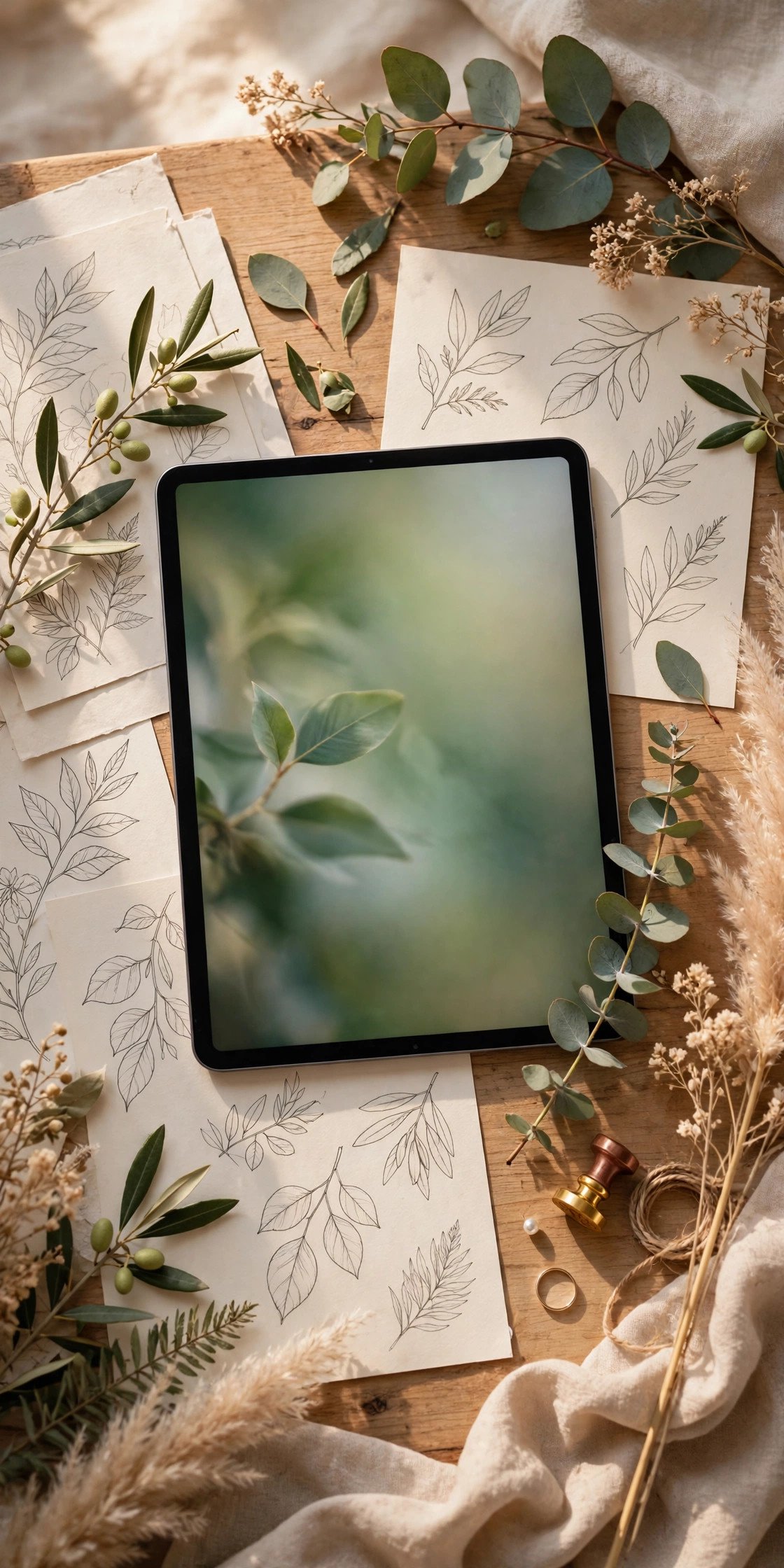
Delicate line-drawn leaves and stems thread through headers, dividers, and icons, giving the site a hand-crafted garden feel without heavy imagery. It is light, fast-loading, and prints beautifully onto matching stationery.
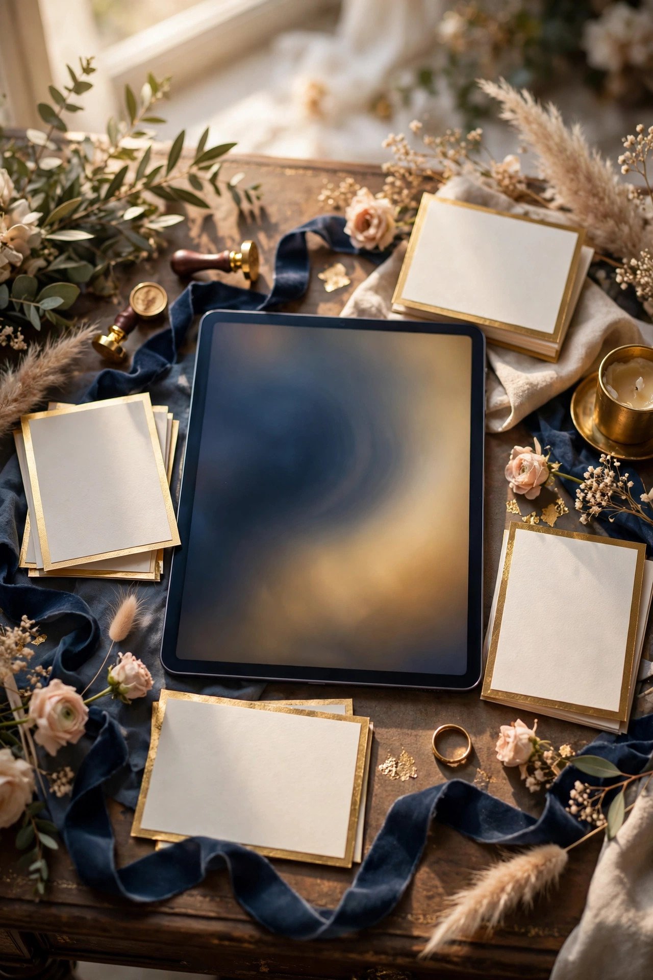
Navy, Gold and Classic Serif
 📌 Save
Deep navy with restrained gold accents and classic serif headlines is the boardroom-to-ballroom classic: traditional, masculine-friendly, and endlessly elegant. It suits historic venues and formal dress codes perfectly.
Terracotta Boho Warmth
 📌 Save
Clay, rust, and sand tones with dried-grass photography create the warm, earthy boho site. It previews desert, ranch, and autumn weddings honestly, right down to what guests should wear on their feet.
Sage and Cream Garden Calm
 📌 Save
A quieter cousin of the botanical look: sage green and warm cream with soft-focus garden photography. The calm palette suits morning ceremonies, conservatory venues, and couples who want the site to feel like a deep breath.
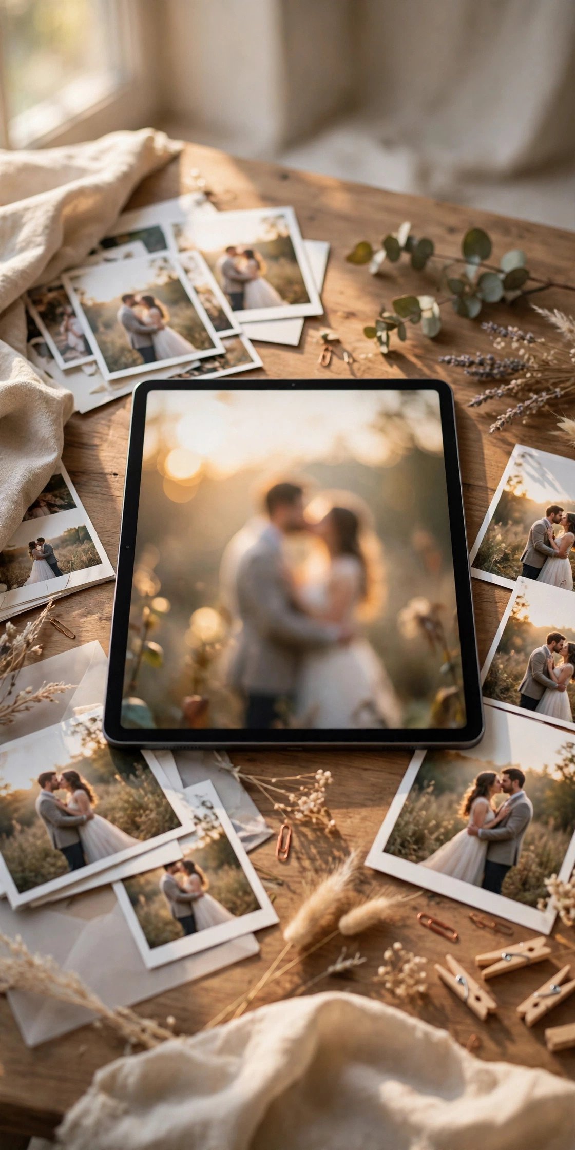
Full-Bleed Photo Hero
 📌 Save
One magnificent photograph filling the entire first screen, names and date floating over it, is still the boldest opening a wedding site can make. Everything after that hero can be simple — the first impression has already done the work.
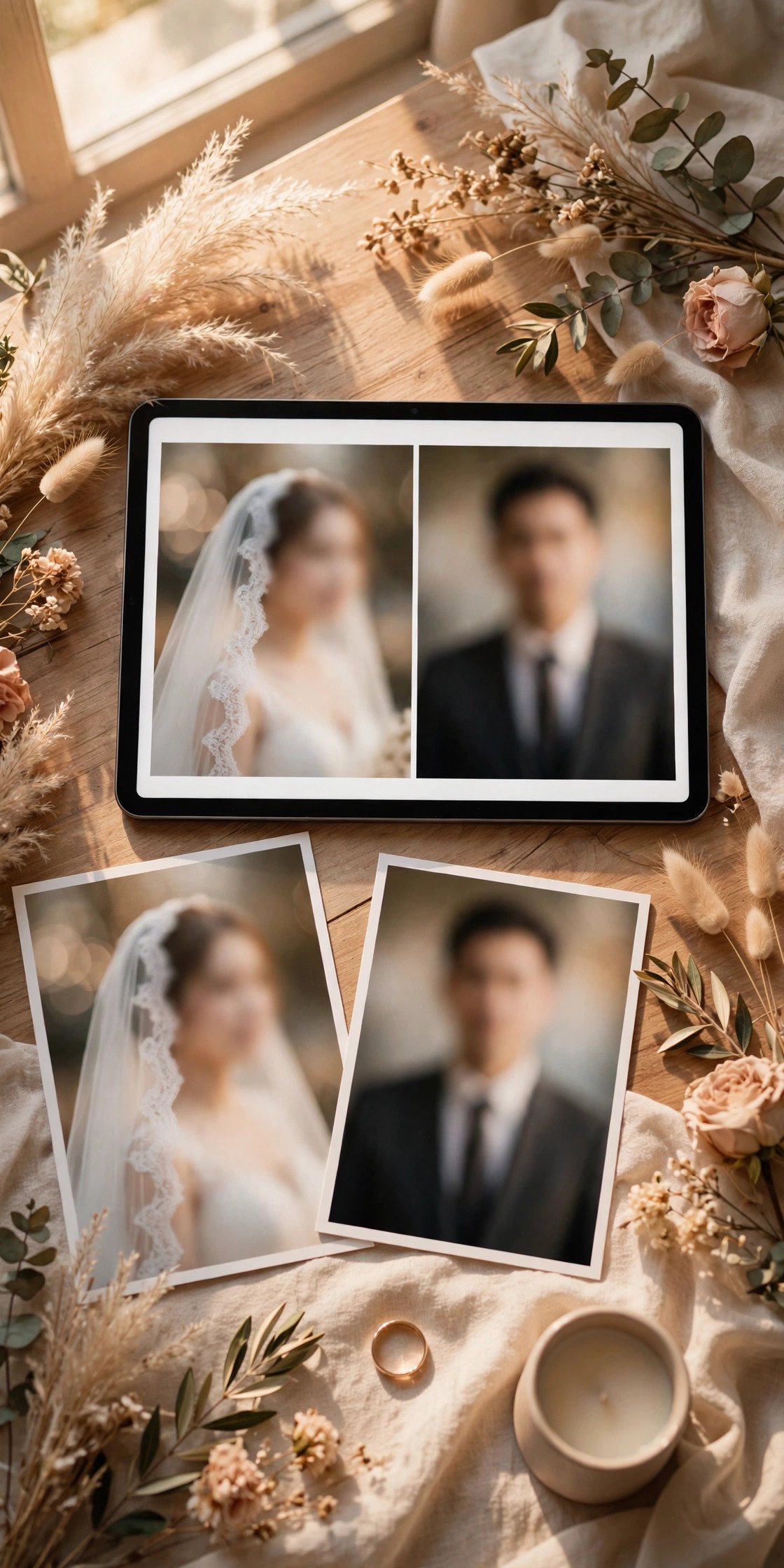
Split-Screen Couple Portraits
 📌 Save
Two portraits side by side — one partner each — merging into a shared photo as guests scroll tells your two-stories-become-one story visually. Playful, modern, and instantly personal in a way templates rarely achieve.
Oversized Serif Typography
 📌 Save
Enormous, elegant serif headlines — your names at poster scale — turn typography itself into the decoration. This direction needs almost no imagery, loads instantly, and feels like a fashion campaign when done with restraint.
Vintage Film Grain Photos
 📌 Save
Grainy, warm film photography with retro type gives your site the feeling of a beloved family album. It is deeply personal, forgiving of imperfect photos, and perfect for couples marrying in historic or family places.
Illustrated Venue Sketch Header
 📌 Save
A line sketch of your actual venue as the site header is charming, unique, and quietly useful — guests recognize the building on arrival. The same sketch can anchor your invitations, programs, and signage for a fully threaded motif.
Monogram Crest Motif
 📌 Save
An interlocked-initials monogram repeated across the header, section icons, and RSVP button gives traditional weddings a sense of establishment. Repetition is the luxury here — the motif earns its elegance by appearing everywhere, identically.
Color-Block Sections
 📌 Save
Divide the site into bold, flat color sections — one per page topic — so guests navigate by hue and the whole site feels like a celebration poster. It is joyful, modern, and surprisingly easy for guests to scan on phones.
Dark and Dramatic Evening
 📌 Save
Charcoal backgrounds, candlelit photography, and pale gold type preview an evening wedding with real drama. It suits winter, ballroom, and city celebrations — and makes white dress photography glow on the screen.
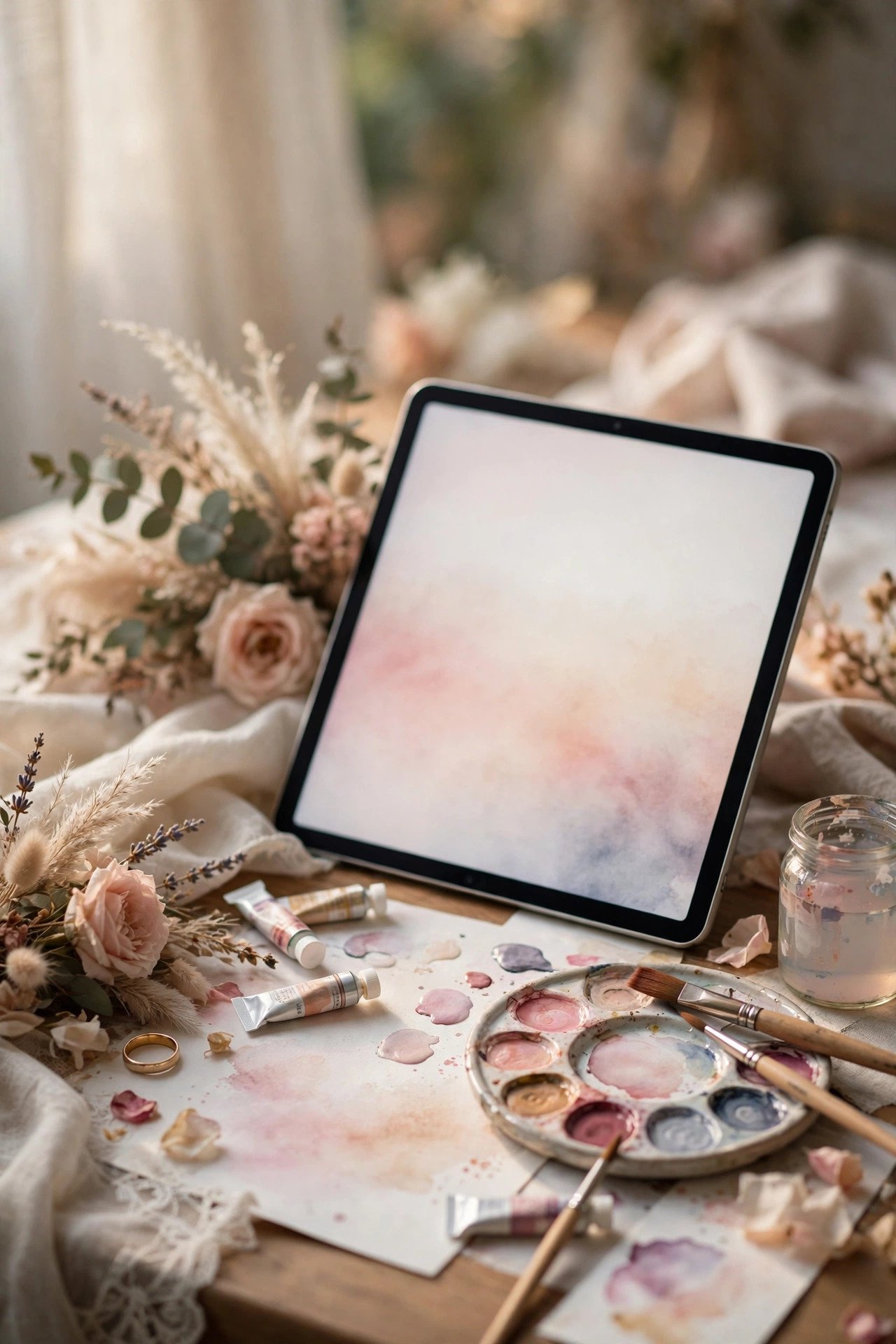
Watercolor Wash Backgrounds
 📌 Save
Soft watercolor washes bleeding in from page edges give an artistic, hand-painted softness that flat color cannot. Beach, garden, and spring weddings wear it beautifully, and it pairs naturally with hand-lettered headings.
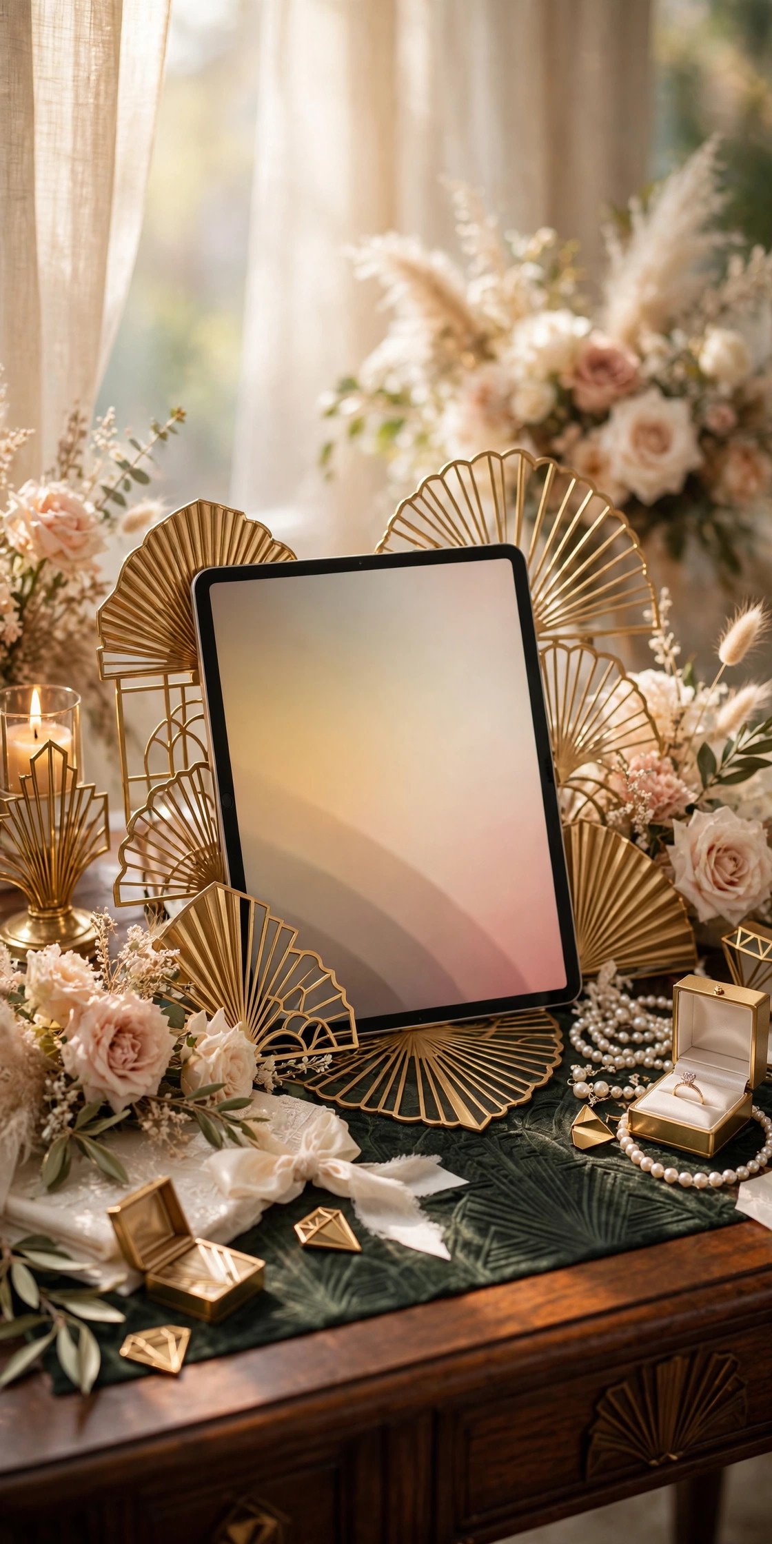
Art Deco Geometry
 📌 Save
Sunbursts, fans, and stepped geometry in gold and black channel 1920s glamour for ballroom and historic-hotel weddings. Deco is a strong flavor — a little geometry in headers and dividers goes a very long way.
Coastal Blue and Sand
 📌 Save
Sea-glass blues, sandy neutrals, and breezy photography design the perfect preview for a coastal wedding. The palette also writes your dress-code page for you: linens, wedges, and layers for the evening breeze.
Autumn Palette Storytelling
 📌 Save
Amber, rust, olive, and cream let an autumn wedding’s site smell faintly of woodsmoke. Seasonal imagery — orchards, turning leaves, candlelight — does the decorating, and guests arrive dressed for the exact day you planned.
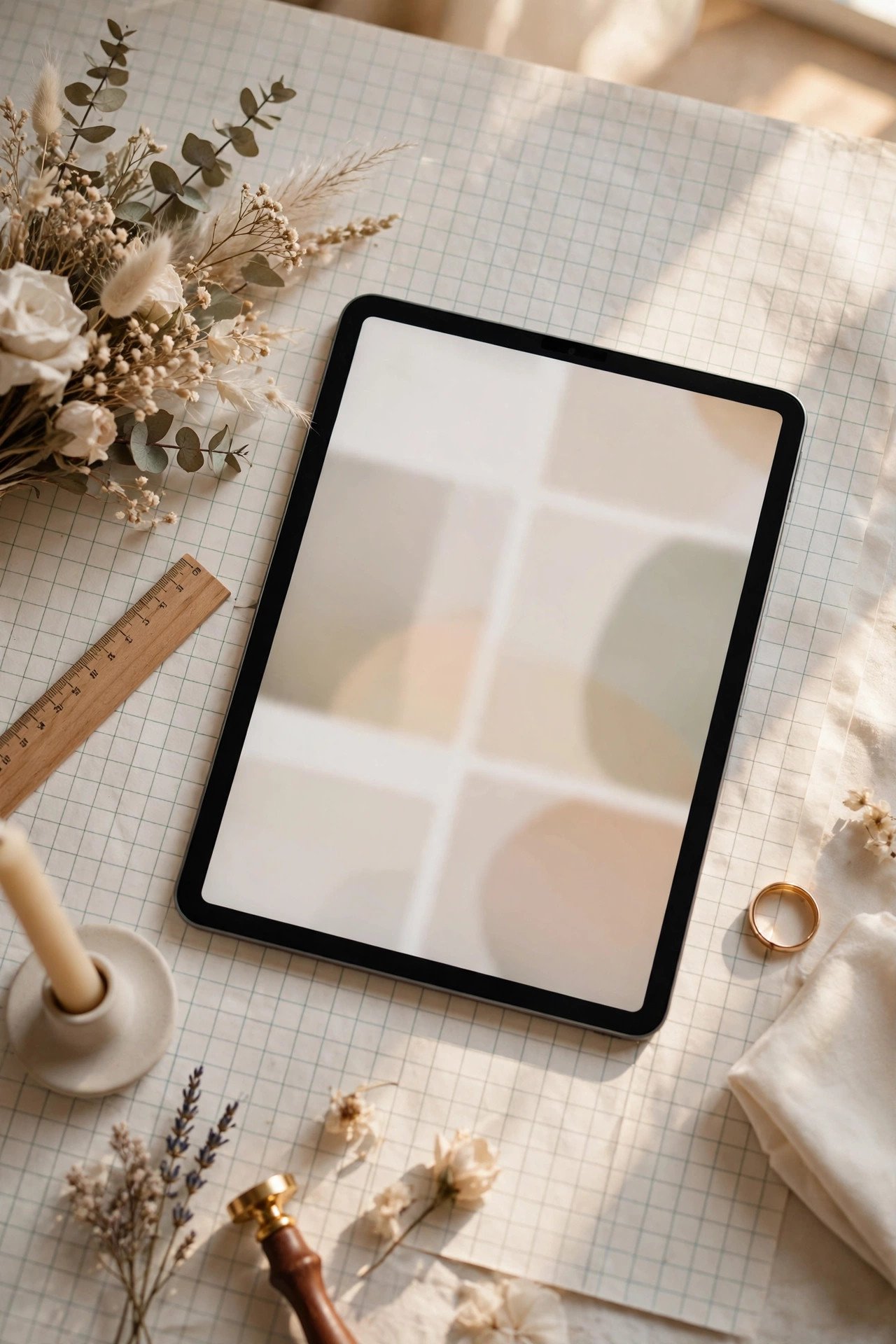
Minimal Grid With Big Numbers
 📌 Save
A crisp grid layout with oversized numbers — the date, the countdown, the table count of events — feels architectural and confident. It is the design for couples who flinch at florals and want information itself to look beautiful.
Matching Print-to-Pixels Suite
 📌 Save
Design the website and the paper suite as one system from the start — same fonts, palette, motif, and illustration style — so guests experience one continuous design from mailbox to mobile. It is the professional secret behind every ‘wow, their whole wedding matched’ reaction.
20 Website Design Ideas (2027) FAQs
How do we choose a design direction?+
Start from the wedding itself: venue style, season, dress code, and the colors already chosen for flowers and paper. The right website design is the one that previews that day honestly — guests should feel the site and the wedding are the same event.
Can we change our website design midway?+
You can, but do it before invitations print. A design change after guests have bookmarked the site causes a small, real confusion — pick a direction, commit, and spend remaining energy on content instead.
How many fonts should a wedding website use?+
Two at most: one display font for headlines and names, one highly readable font for body text. A third font almost always signals an undecided design rather than a richer one.
Do dark website designs work for weddings?+
Yes, for evening, winter, and formal weddings they are striking — provided contrast is checked carefully. Keep body text large and pale, test on a phone in daylight, and give older guests the benefit of generous type sizes.
Should the website match our invitations exactly?+
Ideally the same palette, fonts, and motif, even if layouts differ. Matching makes guests confident they are on the official site, and it makes your whole wedding feel intentionally designed from the first envelope.
Key Takeaways
- Choose one direction from the wedding itself — venue, season, formality.
- One palette, two fonts, one motif, repeated on every page.
- Photography style is a design decision; consistency beats quantity.
- Check contrast and mobile crops before you fall in love with a look.
- Match the paper suite and signage to close the design loop.
Final Thoughts
Design is not the number of pretty things on your website; it is the discipline of one idea, repeated with love. Pick the direction that feels like your wedding day, apply it everywhere without apology, and your site will look professionally designed — because that is exactly what professional design is.