
11 Mistakes Brides Make When Choosing Their Wedding Colors
By zainzari • Published April 2026 • Updated October 10, 2026
 📌 Save
The 11 biggest wedding color mistakes are: following trends blindly, choosing too many colors, ignoring your venue’s undertones, skipping swatch tests in real daylight, forgetting seasonality, clashing with bridesmaid skin tones, overdoing neon brights, ignoring how colors photograph, having no cohesive palette document, making last-minute color changes, and forgetting to coordinate the groom’s party. The fix for nearly all of them is the same discipline: pick 3–5 colors, test real swatches in real light at your venue, lock the palette 9–12 months out, and share one palette document with every vendor.
Your wedding colors touch absolutely everything — the florals, the linens, the bridesmaid dresses, the stationery, the cake, the photos you’ll look at for decades. Get them right and the whole day feels intentional and cohesive. Get them wrong and no amount of expensive décor quite pulls the day together.
The good news: almost every wedding color disaster comes from one of 11 avoidable mistakes. Here they are, in the order brides most often make them — each with a fix so simple you’ll wonder why everyone doesn’t do it.
At a Glance: Every Mistake, Why It Happens & The Fix
| Mistake | Why It Happens | The Fix |
|---|---|---|
| Following trends blindly | Pinterest/Instagram hype cycles | Filter trends through your venue, season & taste |
| Too many colors | Loving everything equally | Cap the palette at 3–5 colors including neutrals |
| Ignoring venue undertones | Choosing colors before booking the venue | Pick the venue first, then build the palette around it |
| No swatch tests in daylight | Trusting phone screens | Test physical swatches in daylight + evening light |
| Forgetting seasonality | Falling for out-of-season florals | Match the palette to your wedding month |
| Clashing with skin tones | One dress color for everyone | Choose universally flattering shades or mix tones |
| Neon overuse | Confusing “fun” with “loud” | Use brights as tiny accents, never as mains |
| Ignoring photography impact | Forgetting the camera sees differently | Ask your photographer which shades misbehave |
| No cohesive palette doc | Vendors working from memory | One shared palette sheet for every vendor |
| Last-minute changes | Cold feet + new inspiration | Set a palette freeze date and honor it |
| Forgetting the groom’s party | All focus on the bridal side | Echo 2–3 palette shades in suits & boutonnieres |
The through-line: most color regrets come from decisions made on screens, in isolation, or too late. Physical swatches, venue-first planning and one shared document prevent nearly all of them.
Following Trends Blindly
 📌 Save
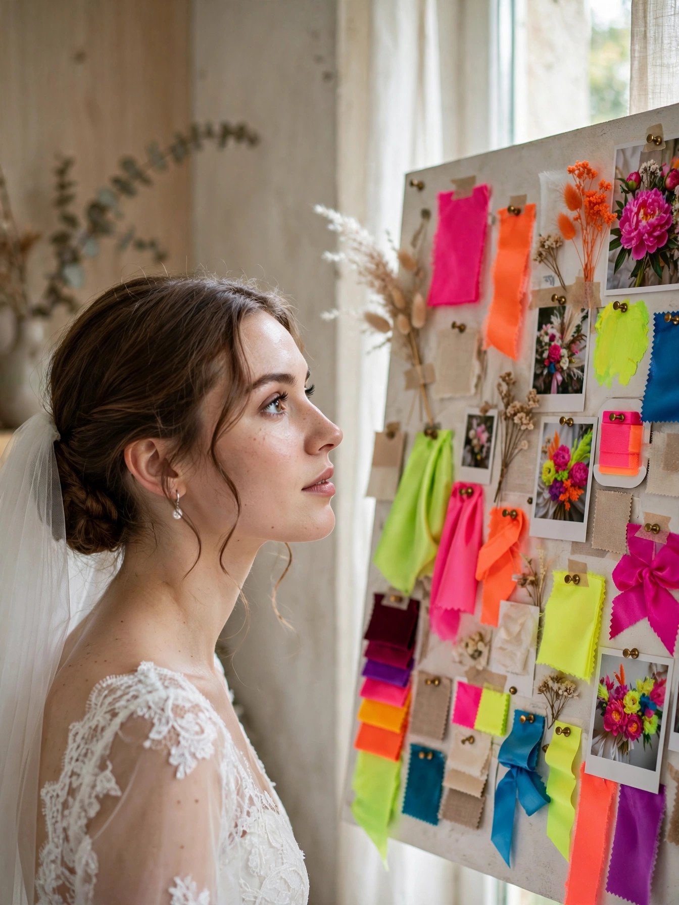
The palette that dominates your feed was designed for someone else’s wedding — adopting it wholesale is the fastest route to a wedding that feels dated within a year.
Trends move at influencer speed, but your wedding photos last forever. The terracotta-everything era, the all-dusty-blue phase, the neon moment — each looked incredible on the accounts that pioneered them and tired on the hundreds of weddings that copied them late. The problem isn’t trends themselves; it’s adopting one without checking whether it suits your venue, your season, your skin tones and your actual taste.
The smart approach is trend-informed, not trend-led. Love a trending color? Test it as one accent in a palette built on shades you genuinely love and that flatter your venue. Ask yourself one question: “Would I still love this if I’d never seen it on Instagram?” If the answer is yes, it’s yours. If not, it’s a trend wearing you.
Read next: 7 Wedding Color Palettes: Jewel Tones
Choosing Too Many Colors
 📌 Save
Loving six colors is fine. Using all six everywhere is how a reception starts looking like a carnival instead of a wedding.
This mistake usually starts innocently: blush for the florals, sage for the bridesmaids, gold for the stationery, navy for the groom’s party, terracotta for the centerpieces, and “a little burgundy for fall.” Each choice sounds lovely on its own. Together, with nothing repeated consistently, the eye has nowhere to rest — and the photos look scattered rather than styled.
The fix is the designer’s rule of 3–5: one or two main colors, one or two accents, one neutral. Neutrals count — ivory, champagne, greenery, soft gray and even black are colors that give bold shades room to breathe. Assign each color a job (mains = dresses + linens, accents = florals + details, neutral = everything structural) and the whole day snaps into focus.
Read next: 12 Budget Wedding Plans That Look Expensive
Ignoring Your Venue’s Undertones
 📌 Save
Every venue comes with fixed colors — carpet, walls, wood tones, uplighting — and a palette that fights them will look off no matter how much you spend on décor.
This is the mistake of choosing colors before booking the venue, or falling in love with a venue and refusing to adjust. A cool-toned ice-blue and silver palette in a rustic barn with amber wood and warm candlelight will always feel subtly wrong. A blush-and-gold scheme in a ballroom with burgundy carpet and brass fixtures competes instead of complementing. The venue is the biggest “color” at your wedding — it wins every fight.
Book the venue first, then visit it at your actual wedding time of day and photograph its permanent elements. Build your palette around what you see: warm woods pair with warm shades (terracotta, gold, amber), cool stone and gray pair with cool shades (dusty blue, sage, silver). Ask the venue about its default lighting temperature too — warm uplighting can turn a crisp white into cream.
Read next: 25 Elegant Indoor Wedding Reception Ideas
Skipping Swatch Tests in Real Daylight
 📌 Save
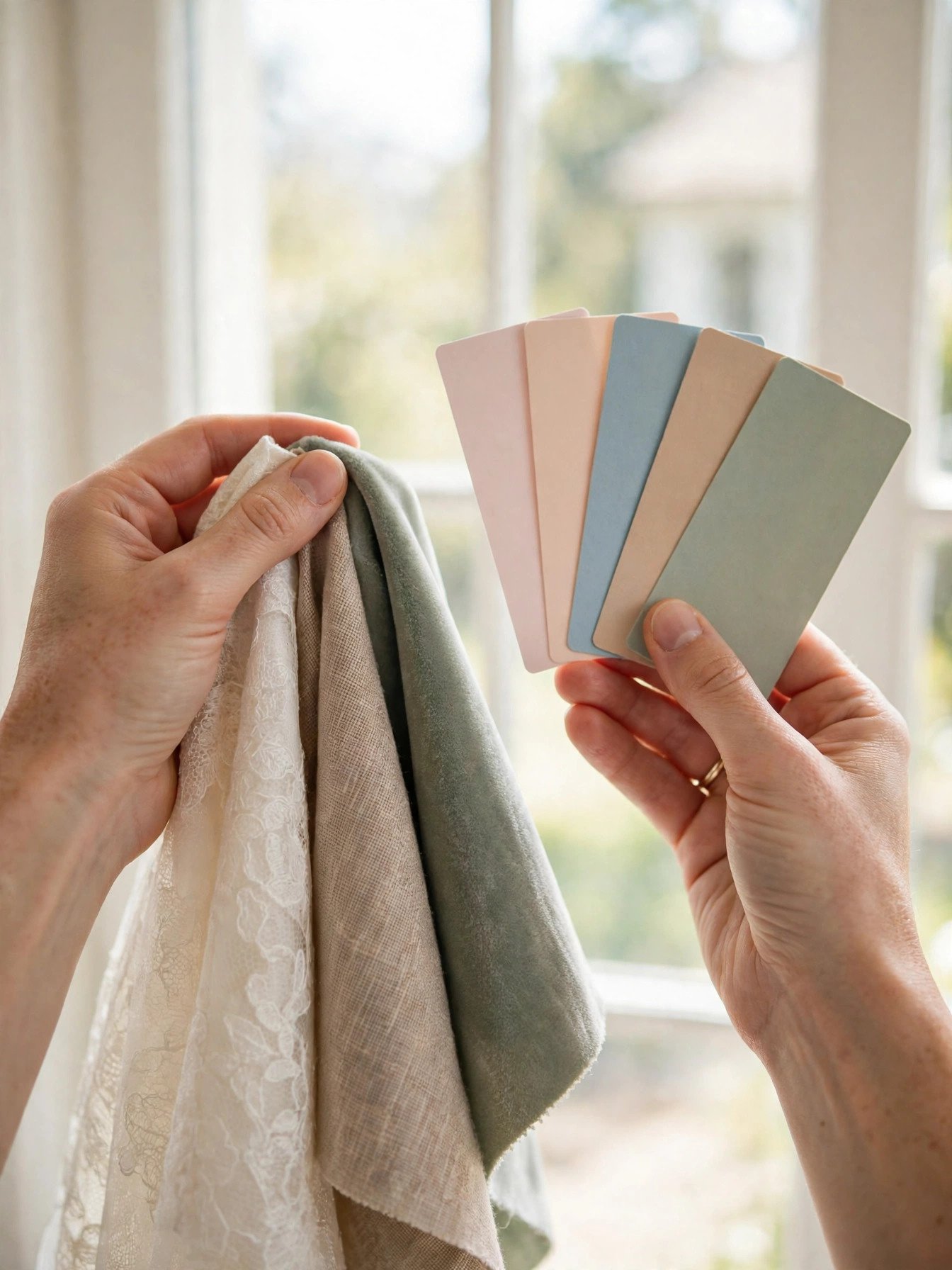
The dusty rose that looked perfect on your phone arrives as bubble-gum pink, because phone screens and real fabric are not the same thing.
This is the most expensive mistake per dollar of prevention. Brides order hundreds of dollars of linens, bridesmaid dresses and stationery based on digital mockups — and screens vary wildly. That “sage” on your laptop is your florist’s “mint.” That “champagne” linen is actually peach under your venue’s lights. Digital color is a suggestion; physical color is the reality.
Order physical swatches of everything — fabric, ribbon, paper, paint chips — and view them together in morning daylight, midday sun and warm evening lamplight, because your reception lighting will be warm. Photograph them at your venue if possible. Colors that harmonize in all three lights are keepers; anything that turns muddy, neon or gray under one of them gets cut.
Read next: Dollar Tree Wedding Decoration Ideas
Forgetting Seasonality
 📌 Save
A June wedding in deep burgundy and hunter green, or a December wedding in pastel peonies — fighting the season fights your budget too.
Seasons have natural palettes for a reason: they’re what grows, what the light looks like, and what feels right in the air. Pastels sing in spring when gardens bloom; saturated jewel tones feel rich against fall foliage; icy metallics suit winter’s crisp light. Push against that and you pay twice — once in money (out-of-season florals cost 2–3x more) and once in cohesion, because the world outside your venue windows tells a different color story than the one inside.
Let your wedding month shortlist the palette. Spring: blush, sage, lilac, butter yellow. Summer: coral, turquoise, bright whites, tropical greens. Fall: terracotta, burgundy, mustard, forest. Winter: emerald, navy, champagne, cranberry. Then pick your 3–5 from the season’s family — your florist will thank you, and your budget will too.
Read next: 27 Prettiest Flower Theme Party Ideas
Clashing With Bridesmaid Skin Tones
 📌 Save
That pale champagne or icy mint you adore can wash out half your bridal party — and they’ll be in every group photo forever.
This is the mistake brides only discover at the first fitting, when the “perfect” dress color makes one bridesmaid glow and another look unwell. Very pale pastels, neon brights and certain yellows are notorious offenders — they clash with specific undertones and create uneven group photos where some faces pop and others disappear. Nobody wants to feel like the bridesmaid the color didn’t work for.
The safest route: choose universally flattering shades — dusty rose, sage, navy, burgundy, slate blue, terracotta — which work across the widest range of skin tones. Even better, embrace the mismatched trend: give your party a color family (all jewel tones, all earth tones) and let each person pick the shade that flatters them. Cohesive, inclusive, and honestly more interesting in photos.
Overdoing Neon Brights
 📌 Save
Hot pink napkins, lime green bridesmaids, electric blue uplighting — neon brights are fun in theory and overwhelming in a full wedding.
Brights have a volume problem: in photos and in person, they shout over everything else. A little neon goes a very long way — it draws the eye relentlessly, which means it also draws the eye AWAY from you, the florals and every other detail you paid for. Full-neon weddings photograph harshly, tire guests’ eyes over a long reception, and age badly in albums.
The fix isn’t abandoning brights — it’s demoting them. Keep neon shades to under 10% of the visual field: a hot-pink lip, neon edge on stationery, one bright floral variety among neutrals, a single neon sign as a photo moment. Against a calm base of ivory, blush or sage, that one electric pop looks deliberate and modern instead of chaotic.
Read next: 15 Stunning Blue Bridal Shower Theme Ideas
Ignoring How Colors Photograph
 📌 Save
Certain colors — bright reds, pure whites, some purples — are notorious for misbehaving on camera, blowing out or shifting in ways the eye never sees.
The human eye is forgiving; a camera sensor is not. Saturated reds can bleed and lose all detail in photos. Stark white next to ivory makes the ivory look dirty. Some purples and magentas shift blue under flash. Black details vanish into shadows. Brides who never consulted their photographer discover these quirks when the gallery arrives — when it’s far too late.
Bring your photographer into the color conversation early. Show them your swatches and ask one direct question: “Which of these will give you trouble?” They’ll flag the problem children instantly — and often suggest easy swaps (a slightly deeper blush instead of bubblegum pink, champagne instead of optic white) that photograph like a dream while looking identical to the naked eye.
No Cohesive Palette Document
 📌 Save
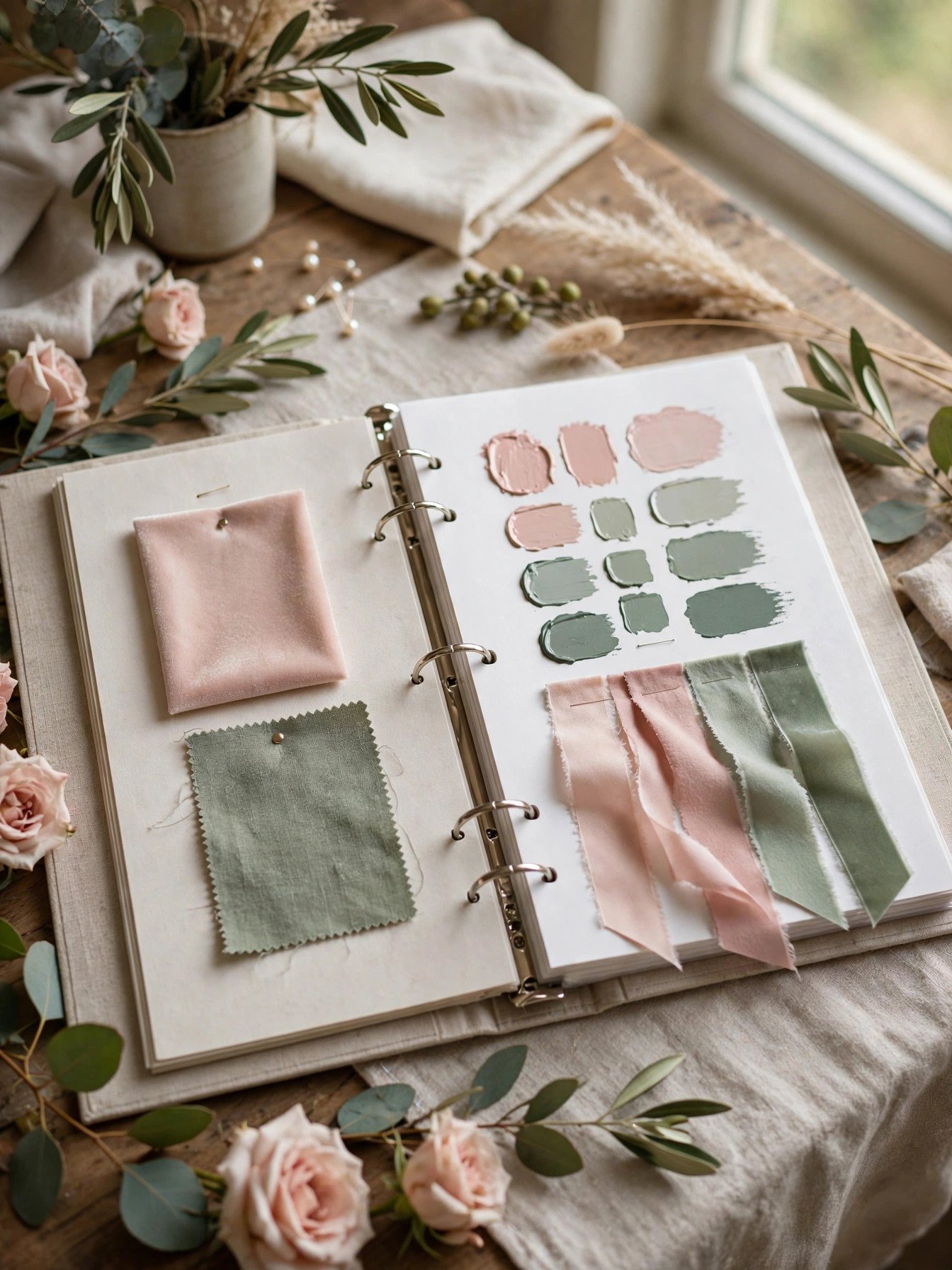
Telling your florist “blush and sage,” your stationer “pink and green,” and your baker “something romantic” guarantees three different weddings.
Vendors can’t read your mind — and color names are hopelessly subjective. Your florist’s “dusty rose” is your rental company’s “mauve.” Without a single reference, every vendor interprets the palette independently, and the day arrives as a patchwork of almost-matching shades that somehow never quite harmonize.
Create one palette document: the 3–5 colors with their names, a photo of the physical swatches, and notes on each color’s job (main, accent, neutral). Send it to every vendor — florist, stationer, baker, rentals, lighting, attire — and bring it to every appointment. When everyone works from the same sheet, “close enough” stops being a problem.
Read next: Ultimate Wedding Planning Checklist
Making Last-Minute Color Changes
 📌 Save
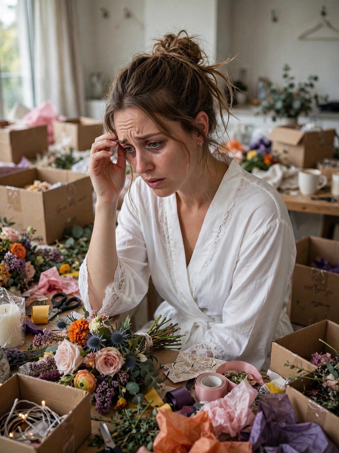
Six weeks out, a new inspiration board makes blush feel boring — but changing colors now means reorders, rush fees and vendors quietly panicking.
Late-stage color doubt is incredibly common and almost always a mirage. By the final months, you’ve stared at your palette so long it feels stale — but your guests will see it fresh, and it will look exactly as designed. Acting on the doubt, though, triggers a cascade: reprinted stationery, reordered linens, florists scrambling for new varieties, and deposits already paid on the old shades.
Set a palette freeze date — three months before the wedding — and treat it as law. After that, only tweaks within the same family are allowed (dusty rose to mauve, not blush to navy). When the itch strikes, revisit your original swatches in daylight instead of opening Pinterest. Nine times out of ten, you’ll fall back in love with the plan.
Forgetting the Groom’s Party Coordination
 📌 Save
The bridal party is perfectly coordinated — and the groomsmen are in whatever black suits with random red boutonnieres they already owned.
This mistake is so common it has a visual signature: stunning bridal-side photos where the groom’s party looks like they wandered in from a different wedding. All the palette energy goes to the bridesmaids, florals and linens, while the groom’s side gets “classic black tux, standard boutonniere” — which clashes with everything when the two halves stand together for portraits.
Echo two or three palette shades on the groom’s side: ties or pocket squares in an accent color, boutonnieres built from the same florals as the bouquets, socks or suspenders in a playful accent for personality. The suits themselves can stay neutral (navy, charcoal, black) — it’s the details that tie the two halves into one wedding.
Read next: 9 Heartwarming Ways to Surprise the Bride
Frequently Asked Questions
How many colors should a wedding palette have?
Most designers recommend three to five colors total: one or two main colors, one or two accent shades, and one neutral to tie everything together. Fewer than three can feel flat, while more than five almost always looks chaotic in photos. Neutrals like ivory, champagne, greenery and soft gray count as colors too — they are the quiet heroes that make bold shades work.
When should we finalize our wedding colors?
Lock in your palette 9 to 12 months before the wedding, right after booking the venue and before ordering bridesmaid dresses or significant decor. Your venue’s fixed elements — carpet, walls, lighting — should influence the decision, so choosing colors before touring venues is putting the cart before the horse. After deposits go out on rentals, florals and linens, changing colors gets expensive fast.
Do wedding colors have to match the bridesmaid dresses exactly?
No — they should coordinate, not match. The most polished weddings use the bridesmaid dresses as one element of the palette, echoed in bouquets, linens and signage rather than repeated identically everywhere. A dress in the palette’s main color with accessories in accent shades looks far more designed than every single detail in the identical shade.
How do I test wedding colors in different lighting?
Gather physical swatches — fabric samples, ribbon, paint chips — and view them together in morning daylight, midday sun and warm evening light, since most receptions happen under artificial lighting. Colors that look identical on a phone screen can be wildly different in person. Test at your venue if possible, because its wall colors and lighting temperature will shift everything.
Can I change my wedding colors after booking vendors?
Small tweaks are usually fine, but a full palette change after booking florists, linen rentals and stationery can mean reorders, rush fees and wasted deposits. If you are having doubts, adjust within the same color family — swap dusty rose for terracotta rather than jumping from blush to navy. Always call vendors before assuming a change is free.
✨ Key Takeaways
- Book the venue first, then build your 3–5 color palette around its permanent tones and lighting.
- Never trust screens — test physical swatches in daylight, midday sun and warm evening light.
- Match your palette to your wedding month; in-season colors are cheaper, fresher and more cohesive.
- Share one palette document with every vendor so nobody interprets “dusty rose” differently.
- Set a palette freeze date three months out — and coordinate the groom’s party, not just the bridesmaids.
Final Thoughts
Choosing wedding colors feels like a small decision until you realize it touches every single detail of the day. The brides who love their palettes years later aren’t the ones with the trendiest shades — they’re the ones who tested real swatches, respected their venue, kept the palette edited, and froze it early. Avoid these 11 mistakes and your colors won’t just look beautiful; they’ll look like they were always meant to be yours.




One Comment